Create a digital product to promote luxury apartments and make users interested in buying them.
Context
Acqualdava is a brand of luxury residences in Porto (Portugal). They requested a digital product to sell both their buildings (Acquasolo and Acquaduo).
Solution
The solution was to create a responsive website with a user-friendly experience that communicates the modern design of the buildings and highlights the advantages and characteristics of the area to engage with the target users to make them buy apartments.
Project Goals
– Gather insights from users to understand their behaviour; – Design a user responsive website;
My Role
– Market research (competitor analysis); – User research (proto-personas and user stories); – Sitemap; – Information architecture; – Low-fidelity wireframes; – Visual design; – Interactive prototype;
Agency
Unlock Brands (Creative Director: Miguel Viana)
1. Market and user research
Understanding the problem
With the information the company provided in the briefing, I decided to do market and user research to understand their competitors and user behaviour.
Competitor Analysis
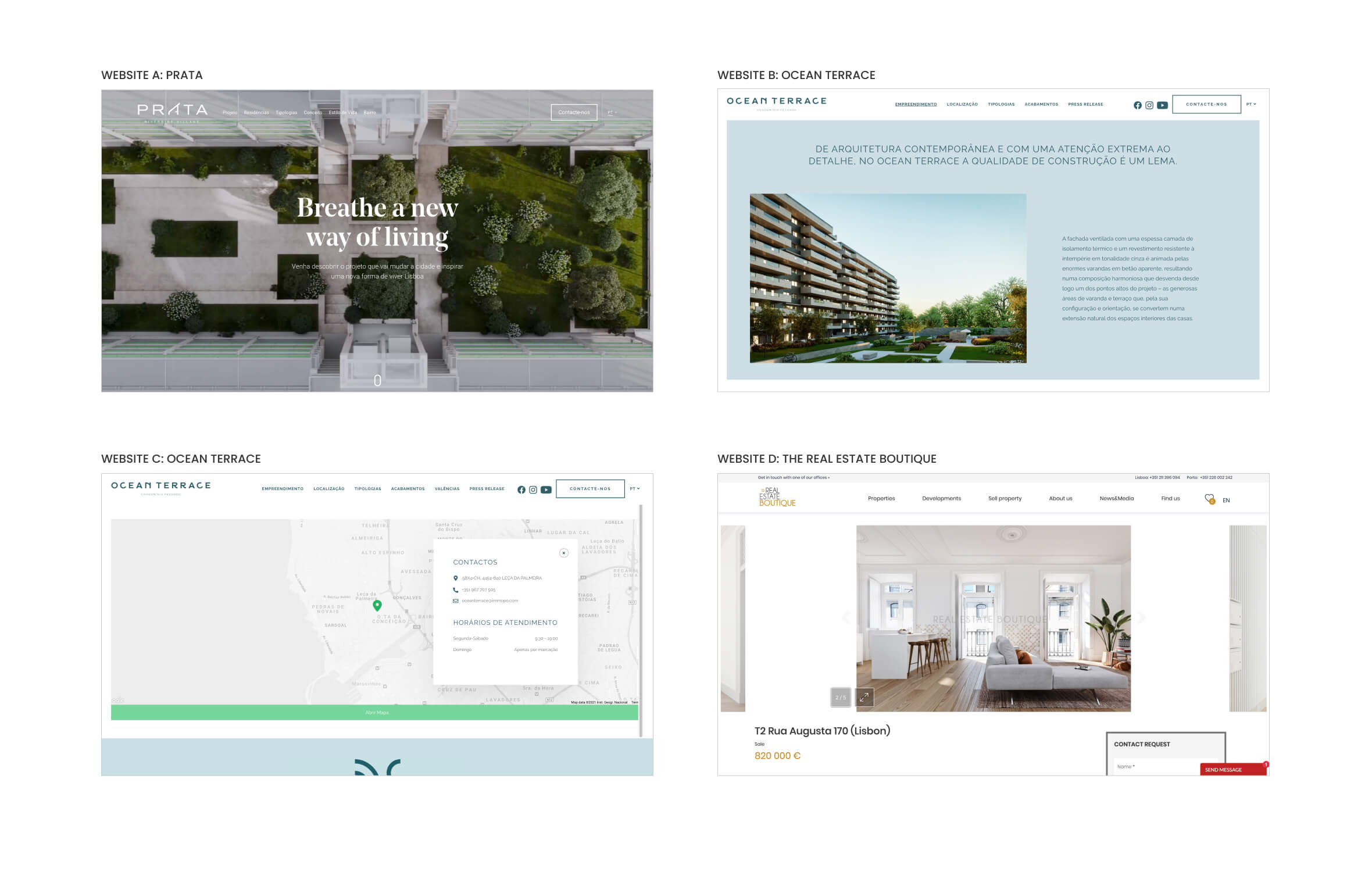
By analysing and evaluating its competitors, the competitor analysis allowed me to understand their pain points. This method allowed me to find new solutions for problems and find out new opportunities. Below I describe a brief summary which I did for four websites:
Website A: Prata
An extremely appealing video is great to grab the user’s attention. The website communicates a modern look although the navigation menu is difficult to read in some parts to the colours of the video (adding a background to the main header could solve this problem).
Website B: Ocean Terrace
A brief history of the building also engages with the user. The text should have some more impact by having a white background (for instance: in a shape of a rectangle).
Website C: Ocean Terrace
A map is very important to let the users know where exactly the building is located. In this example, the improve the design the green pin should be a little larger and the ‘Abrir Mapa’ (Open Map) green button should be smaller.
Website D: Real Estate Boutique
An information architecture with just a few elements it’s great to make the user pay more attention to the right content. In this example, the space between each image should be smaller with the two buttons (slide show number and full-screen) more on the left.
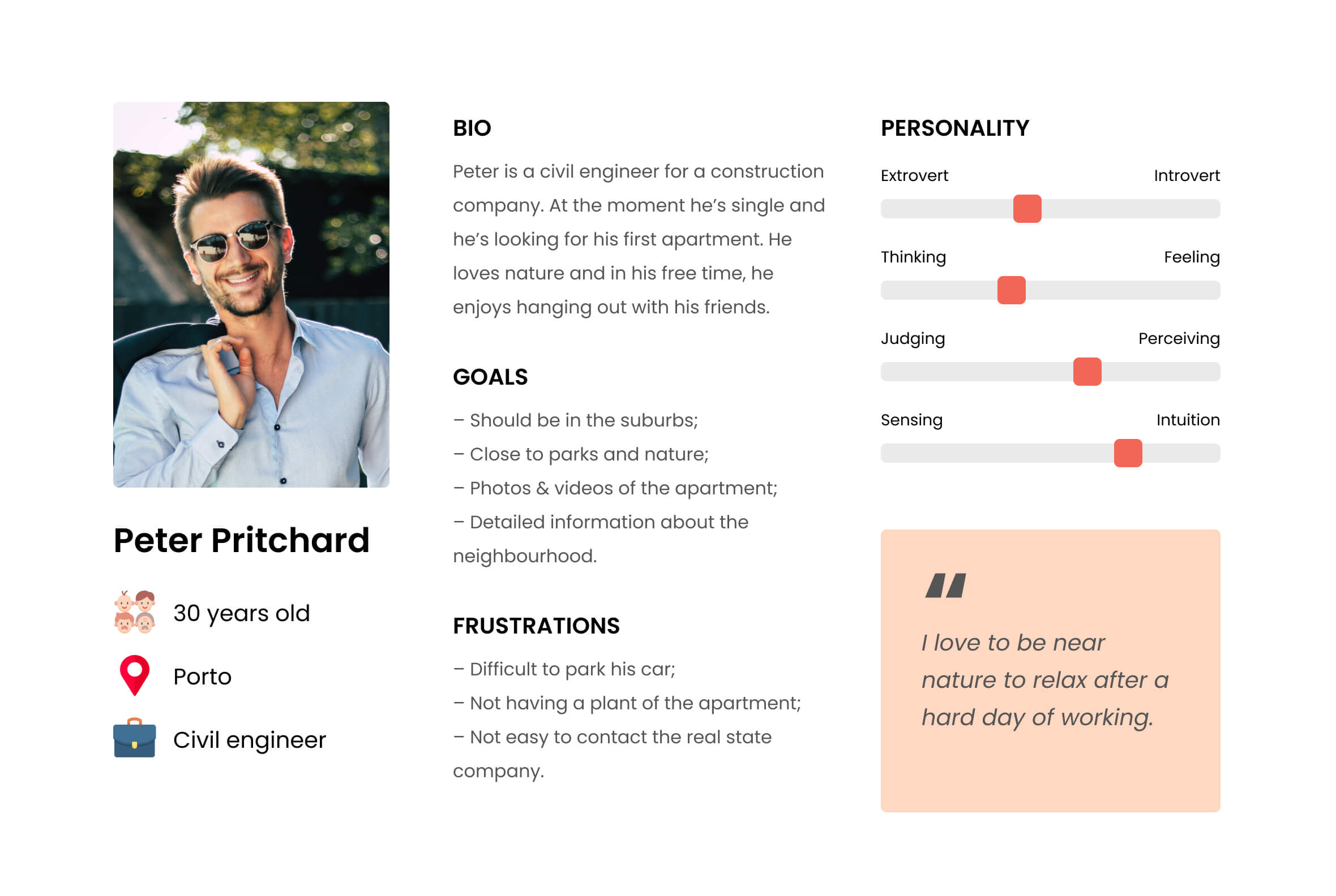
Proto-Persona
With the information I collected from the briefing analysis and from the research, I built a proto-persona to make it very clear who will be the target user for this digital product.
User Stories
I created user stories based on the proto-persona to understand all the contents this digital product should have. Below I placed three of them.
User Story #1
As a user, I want to view a gallery of photos and videos of all buildings.
Priority: High
User Story #2
As a user, I want to know the characteristics of the each apartment (for instance: square meters, number of bedrooms and bathrooms, building plant, etc.).
Priority: High
User Story #3
As a user, I want to be able to contact the real estate company very quickly.
Priority: High
User Story #4
As a user, I want to know where exactly these buildings are located.
Priority: High
User Story #5
As a user, I want to know the characteristics of the area (for instance: parks, hospitals, schools, etc.).
Priority: High
User Story #6
As a user, I want to know more about the history of these buildings.
Priority: Medium
2. Ideation
Designing the solution
In the second phase, I started by creating the website’s sitemap to understand how many pages there will be. Then I draw all the low-fidelity wireframes and I created the visual design based on the brand identity.
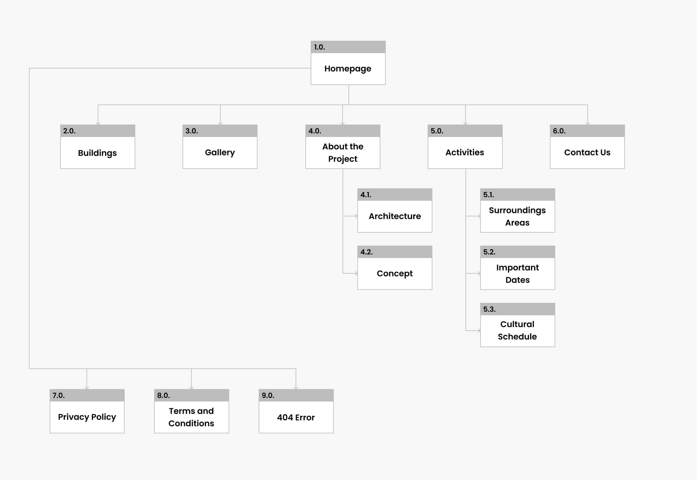
Sitemap
The previous research allowed me to build the sitemap with all hierarchies and connections between each page.
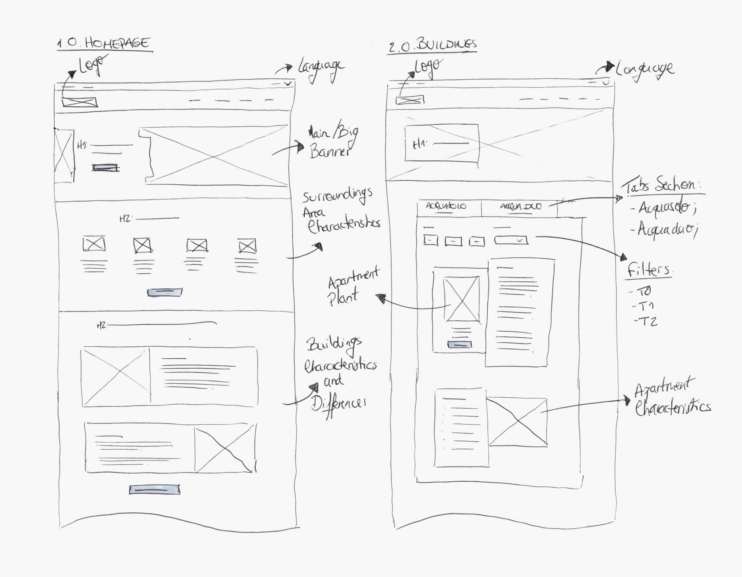
Low-Fidelity Wireframes
I started by sketching all low-fidelity wireframes on paper because it allowed me to focus more on the design of the information architecture for each page. Each page was designed for desktop and mobile.
Visual Design
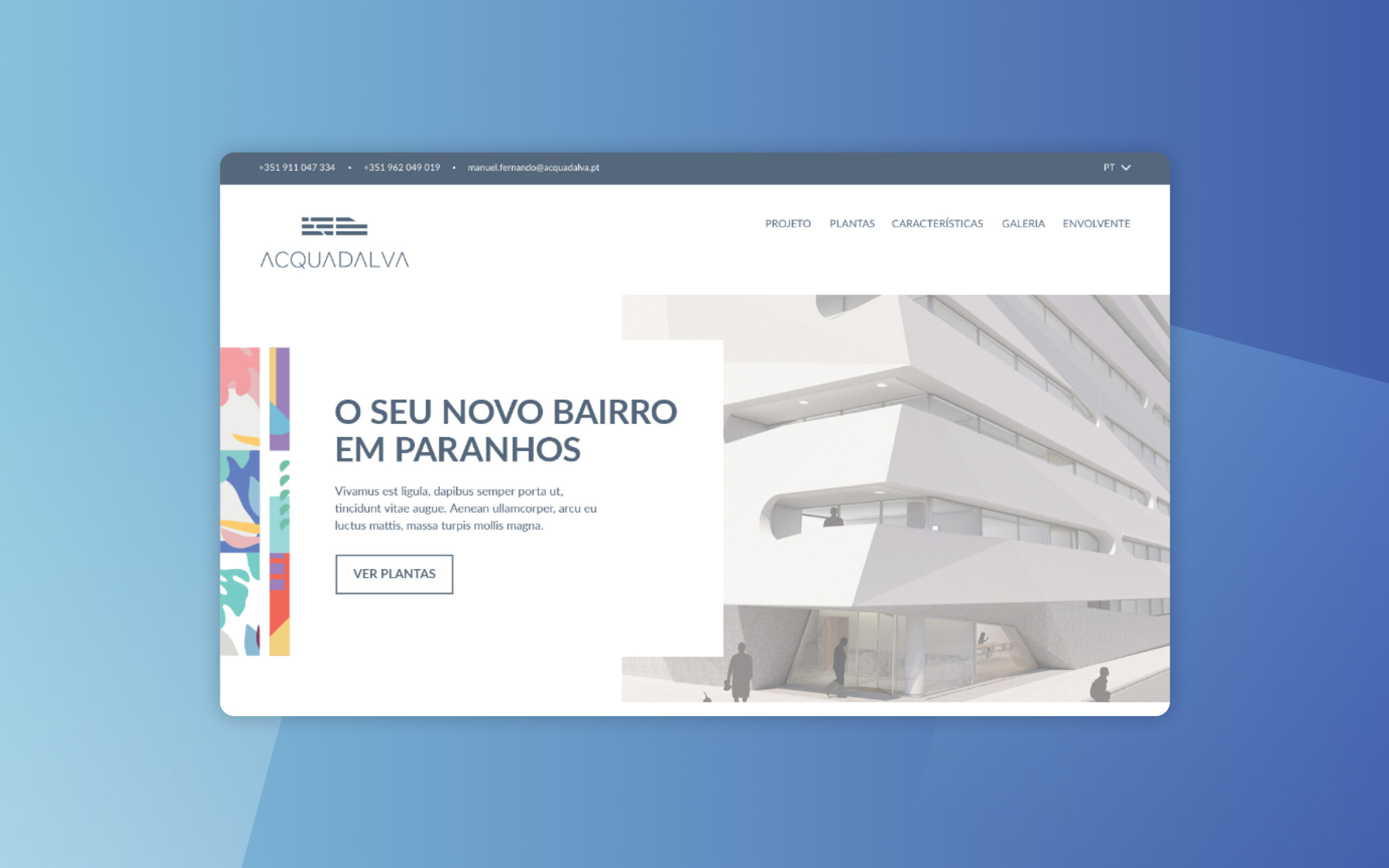
For the visual design of this digital product, I wanted to communicate a modern, minimalistic and clean concept based on the Acquadalva brand. For the font, it was used Lato and for the colours, I decided to use blue as the main colour and also apply the visual elements from the brand on some parts of each page.
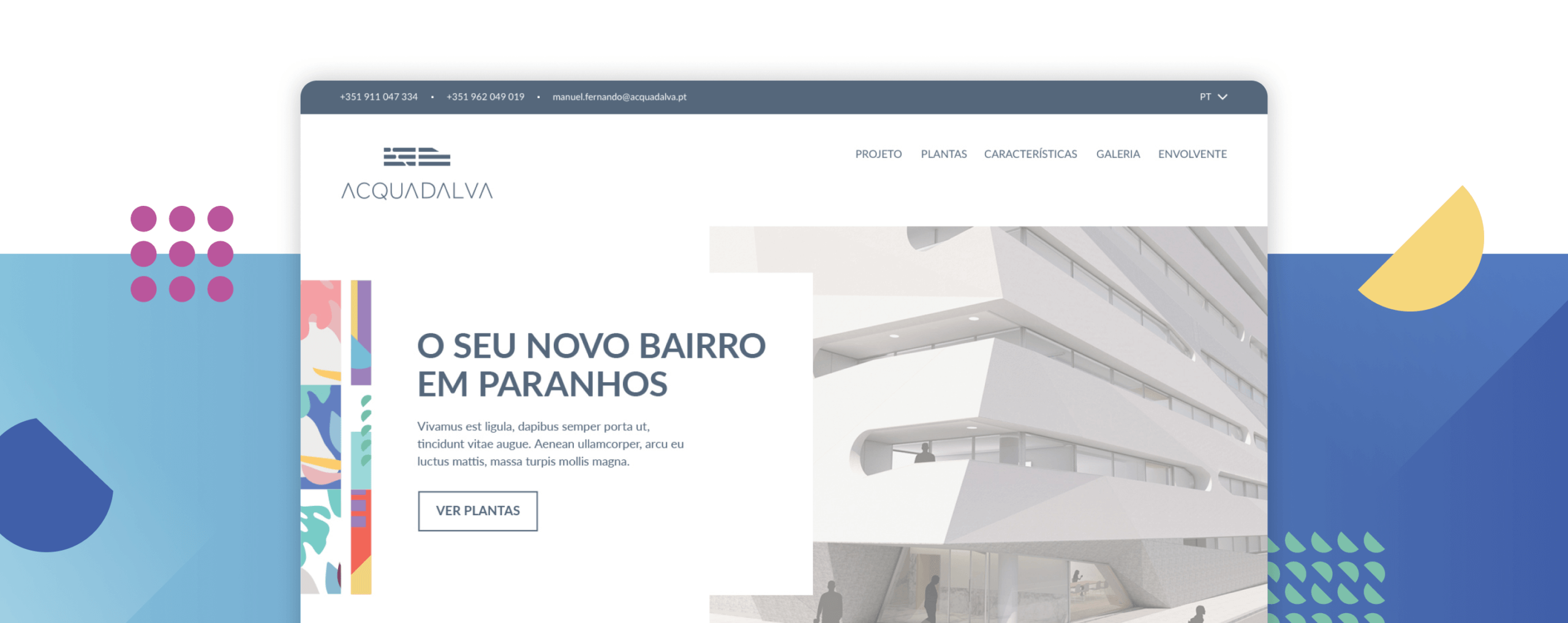
Main Header
For the main header on the homepage I decided to use an image of one of the buildings to communicate que architecture and the concept.
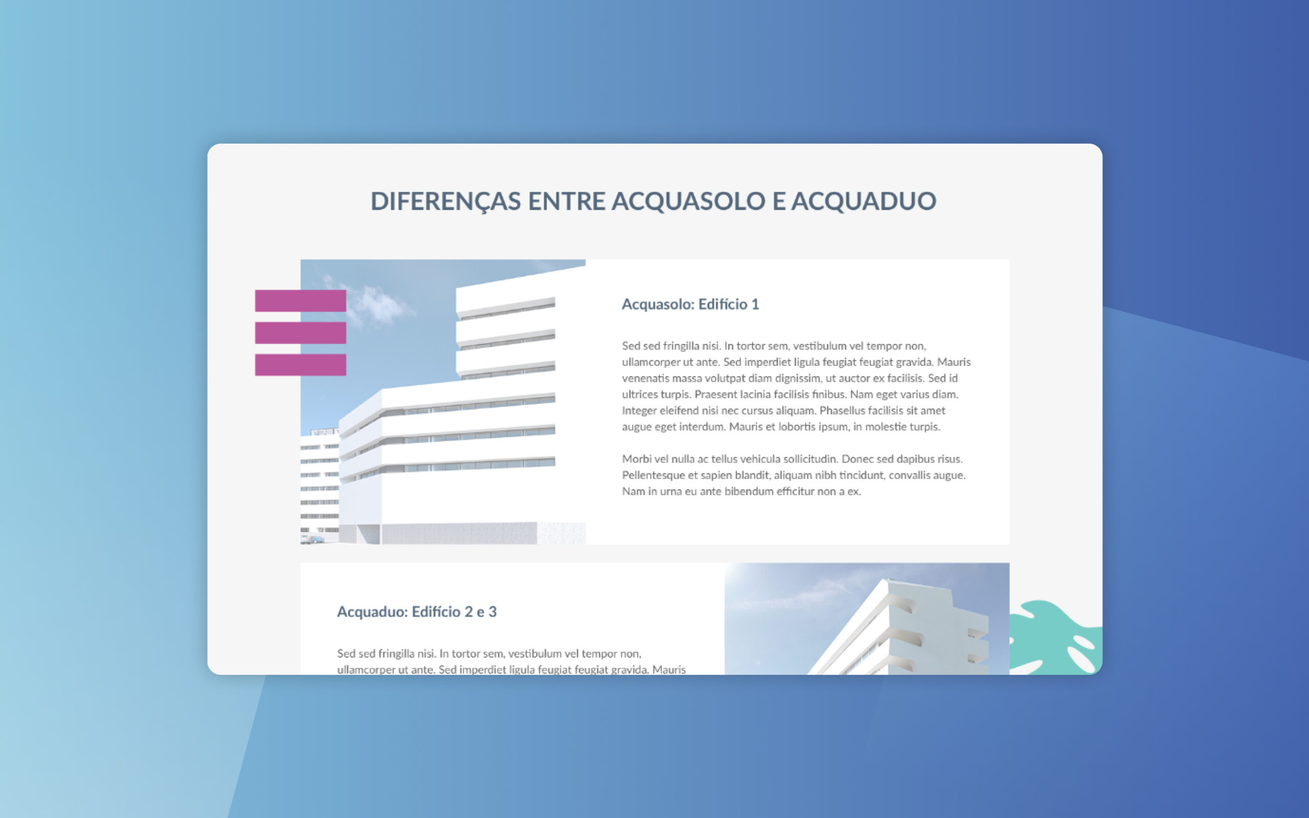
Building Differences
For this section, it was placed information about both buildings and their main differences (acquasolo and acquaduo).
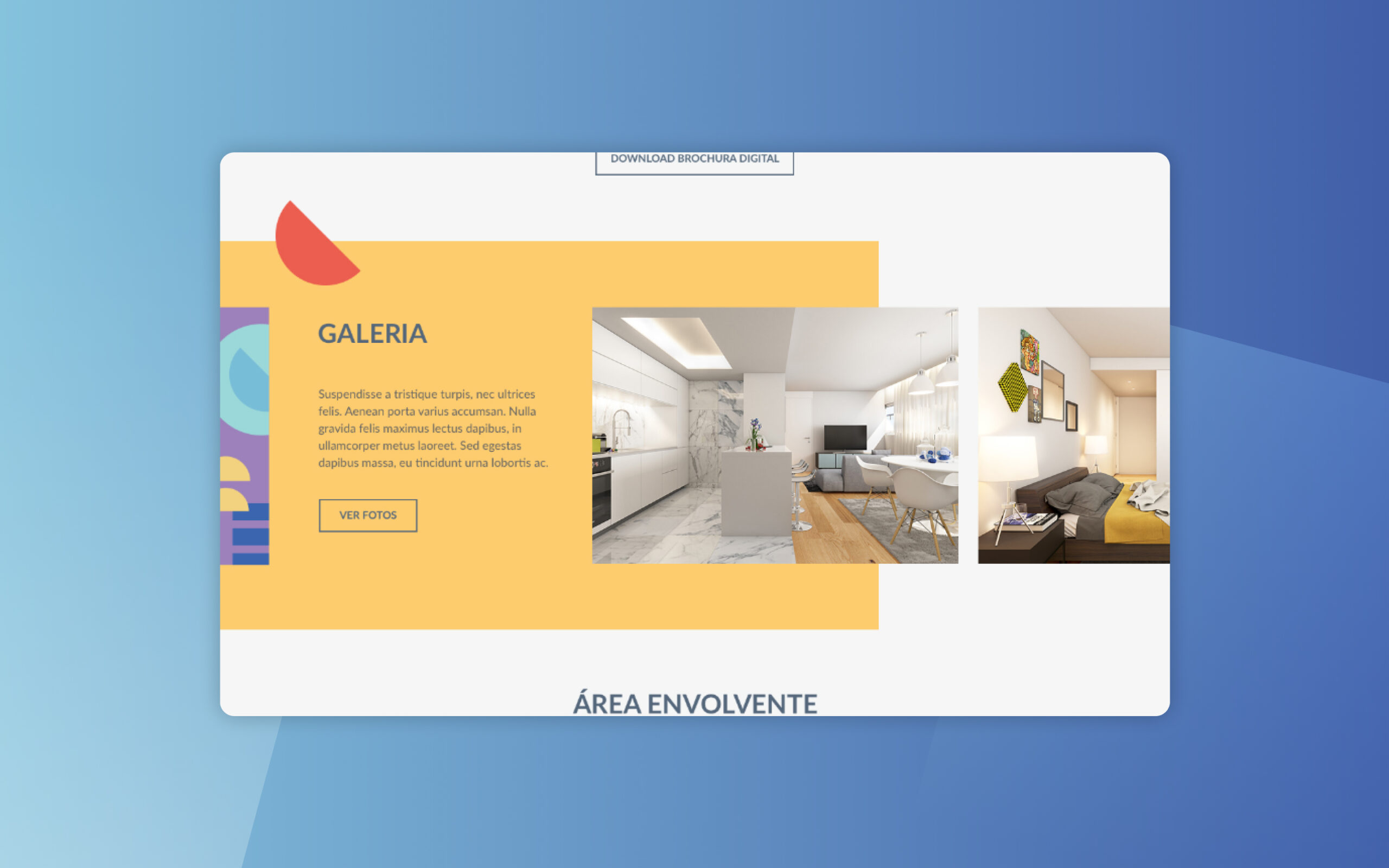
Gallery
A photo gallery was places for users to have a clear idea of each apartment, both buildings and surrounding areas.
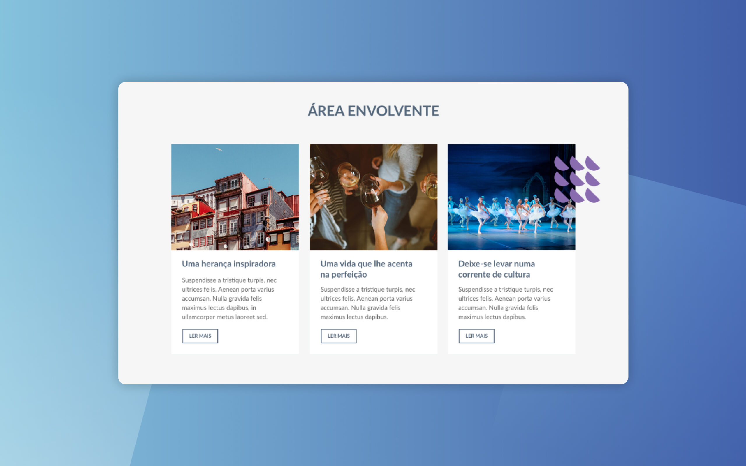
Surrounding Areas
Information about activities, restaurants and theatres in the surrounding areas is very important to make users more interested in this area.
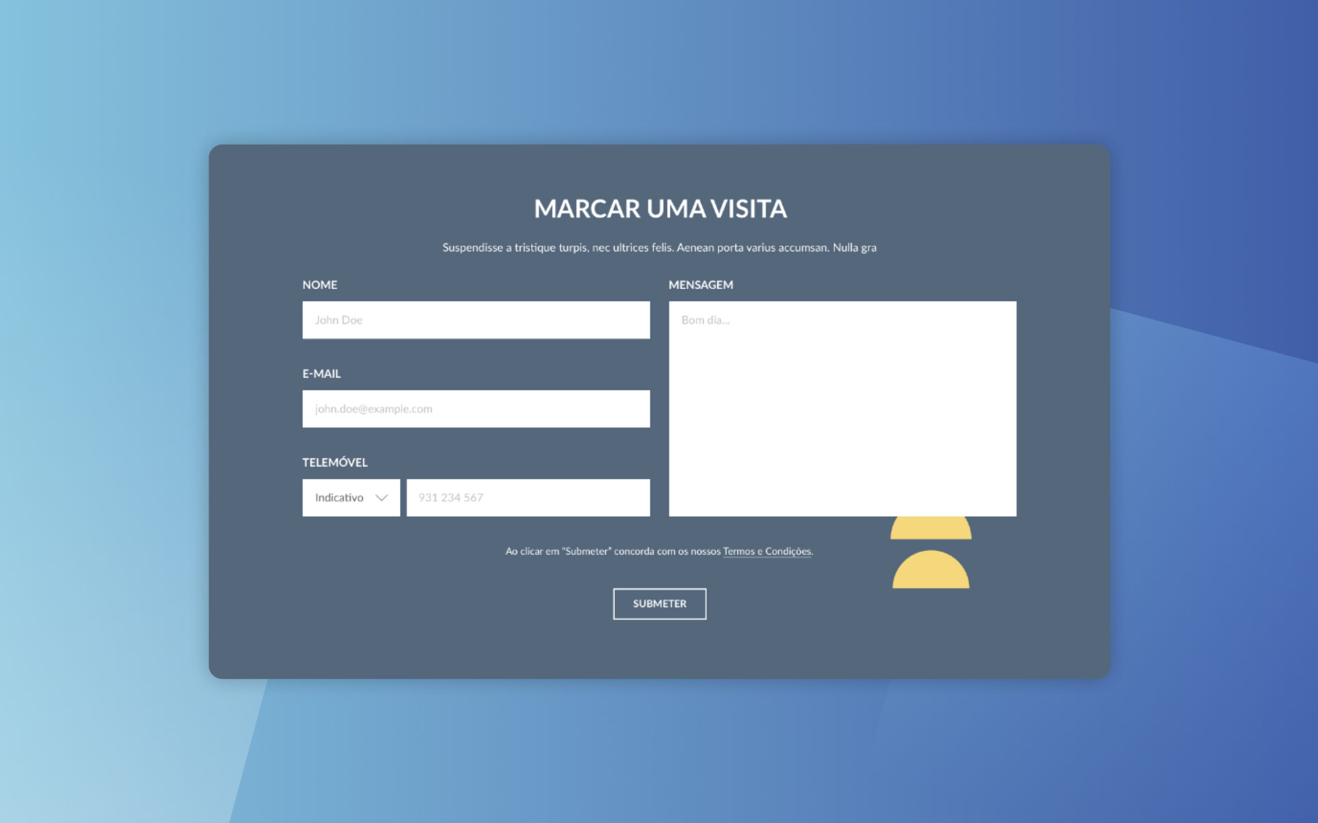
Book an apartment visit
An extremely clear and simple form was added to every page to make it more easy the booking process. The contents of this forms are: Name, Email, Mobile Number and Message.
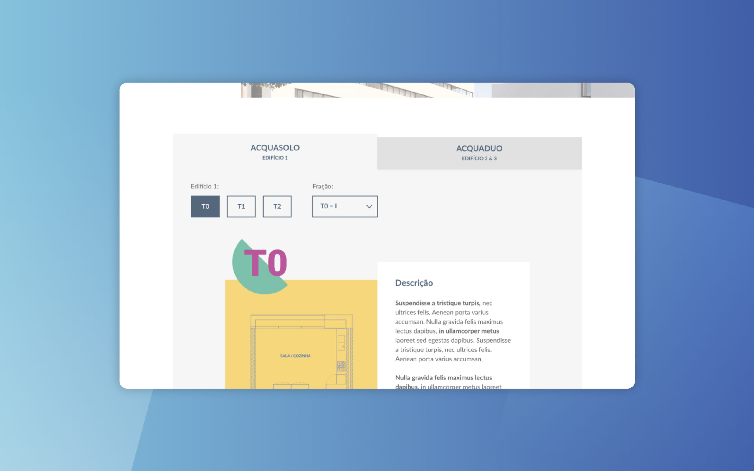
Acquasolo and Acquaduo
Users can explore both buildings and see the characteristics of each apartment by adjusting the filters. They can also view a detailed plant of each apartment and download a brochure.
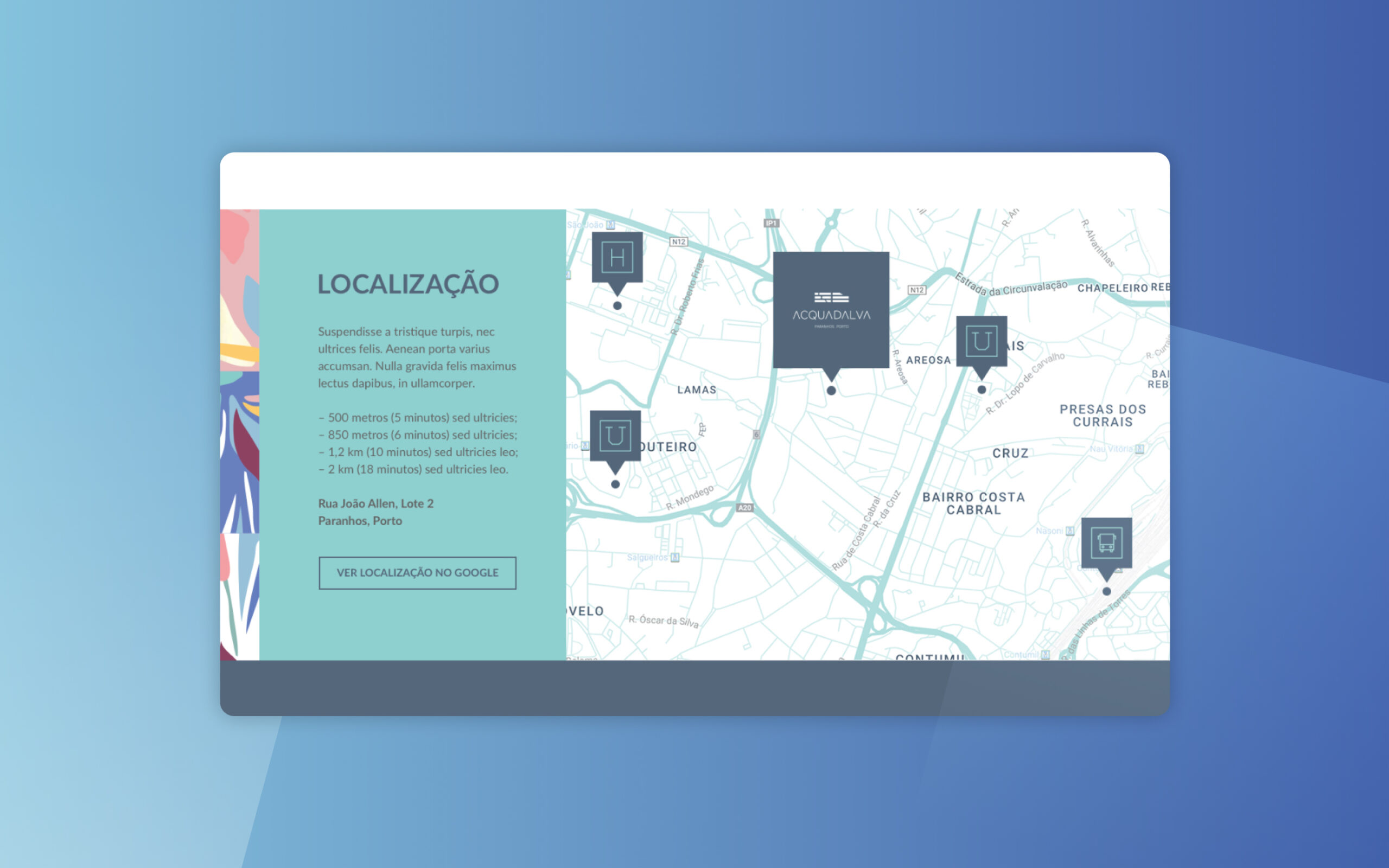
Location
A clear map with the location of these buildings and the main important places (for instance: hospital, schools, train station, etc.) in the surrounding areas are very important for the user know where exactly both buildings are located and the distance of these places.
Learnings
This project was a great opportunity to apply all my skills regarding user research, low-fidelity wireframes, visual design and interactive prototyping. It allowed me to improve my skills in market and user research and this helped me to create a better digital product.