Create a digital product to promote the venue and bring companies to host their events.
Context
Boston Tech Marketing is a consultancy company that provides digital marketing services. The main goal was to create a new digital product that could bring new leads.
Solution
The solution was to build an engaging landing page to promote their services, show their process, their advantages, etc. with CTA buttons on each section.
Project Goals
– Understand their market (create a competitor analysis); – Create proto-personas to define the target user; – Create user stories to generate content; – Design an interactive prototype.
My Role
– Strategy (competitor analysis); – User research (proto-personas and user stories); – Information architecture; – Low-fidelity wireframes; – Visual design; – Interactive prototype.
1. Market and user research
Understanding the problem
With the information the company provided in the briefing, I decided to do market and user research to understand their competitors and user behaviour.
Competitor Analysis
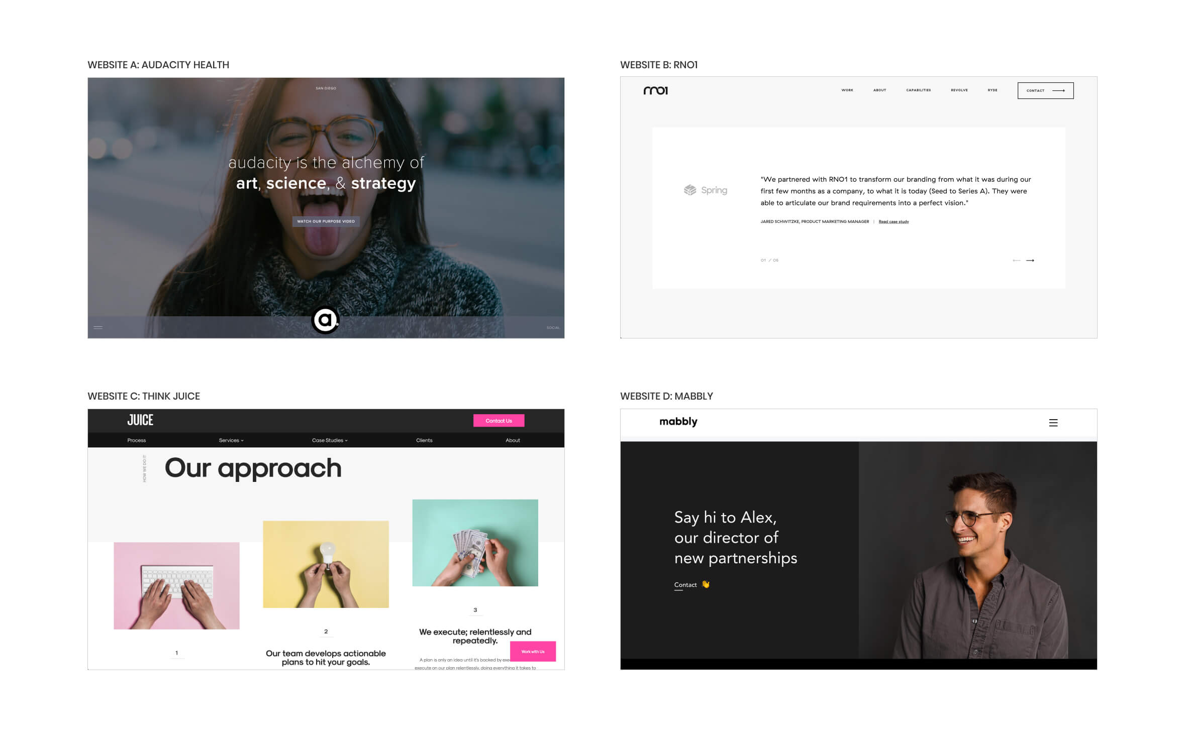
By analysing and evaluating its competitors, the competitor analysis allowed me to understand their pain points. This method allowed me to find new solutions for problems and find out new opportunities. Below I describe a brief summary which I did for four websites:
Website A: Audacity Health
A strong and impactful image is extremely important to communicate a solid message. In this main header, the text should be larger and bolder to create more contrast with the background.
Website B: RNO1
Testimonials are a great way to build trust with the user. By reading short stories about how previous projects were handled, it will make the target user feels more confident to work with the company.
Website C: Think Juice
For new clients, it’s important to show how the process is done. By showing a simple process, makes it more easy and clear for the user to understand.
Website D: Mabbly
Providing a final CTA to invite users to contact the company, is a great way to start a conversation. By using a photo of a person with a friendly face, makes the user more willing to contact the company.
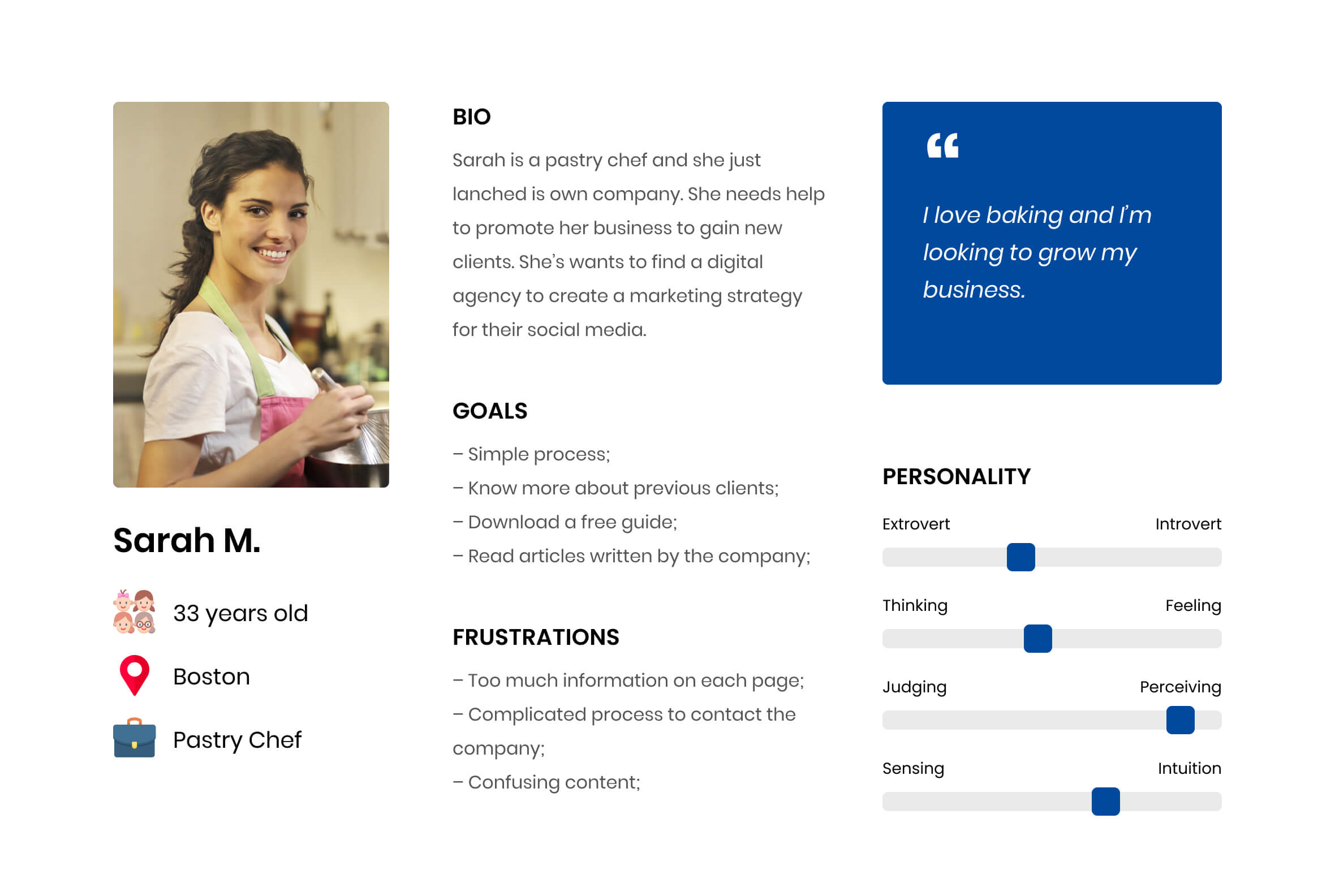
Proto-Persona
With the information I gathered from the interview, I built a proto-persona to make it very clear who will be the target user for this digital product.
User Stories
I created user stories based on the proto-persona to understand all the contents this digital product should have. Below I placed six of them.
User Story #1
As a user, I want to know the benefits of working with this company.
Priority: High
User Story #2
As a user, I want to know what previous clients have to say about this company.
Priority: High
User Story #3
As a user, I want to understand the whole process with the company.
Priority: High
User Story #4
As a user, I want to be able to read some articles published by the company.
Priority: Meddium
User Story #5
As a user, I want to be able to contact the company quickly.
Priority: High
User Story #6
As a user, I want to know more about this company.
Priority: High
2. Ideation
Designing the solution
In the second phase, I draw low-fidelity wireframes and then I created the visual design.
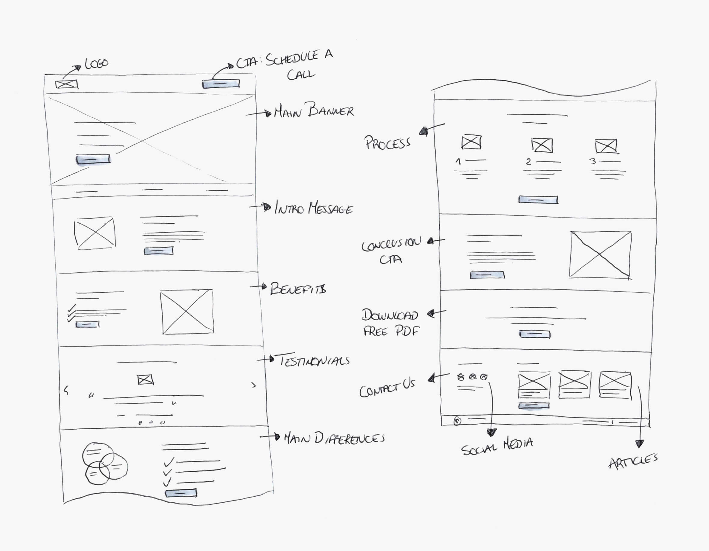
Low-Fidelity Wireframes
When I was sketching all low-fidelity wireframes, I structured all contents that should be on each section.
Visual Design
For the visual design of this digital product, I wanted to communicate an engaging, modern and clean concept. For the font, I decided to use Poppins due to its geometry and for the colours, I decided to use different blue tones for the main elements and for the CTA buttons I decided to use red to create more contrast and make the user focus more on these elements.
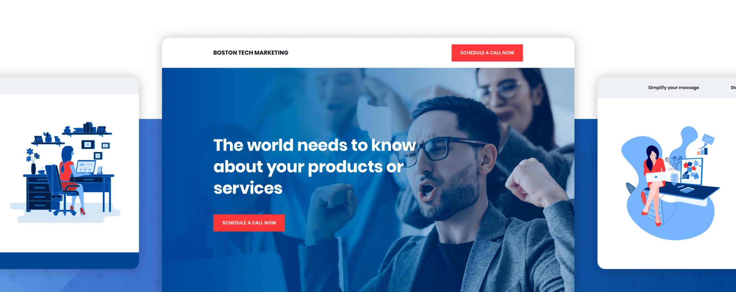
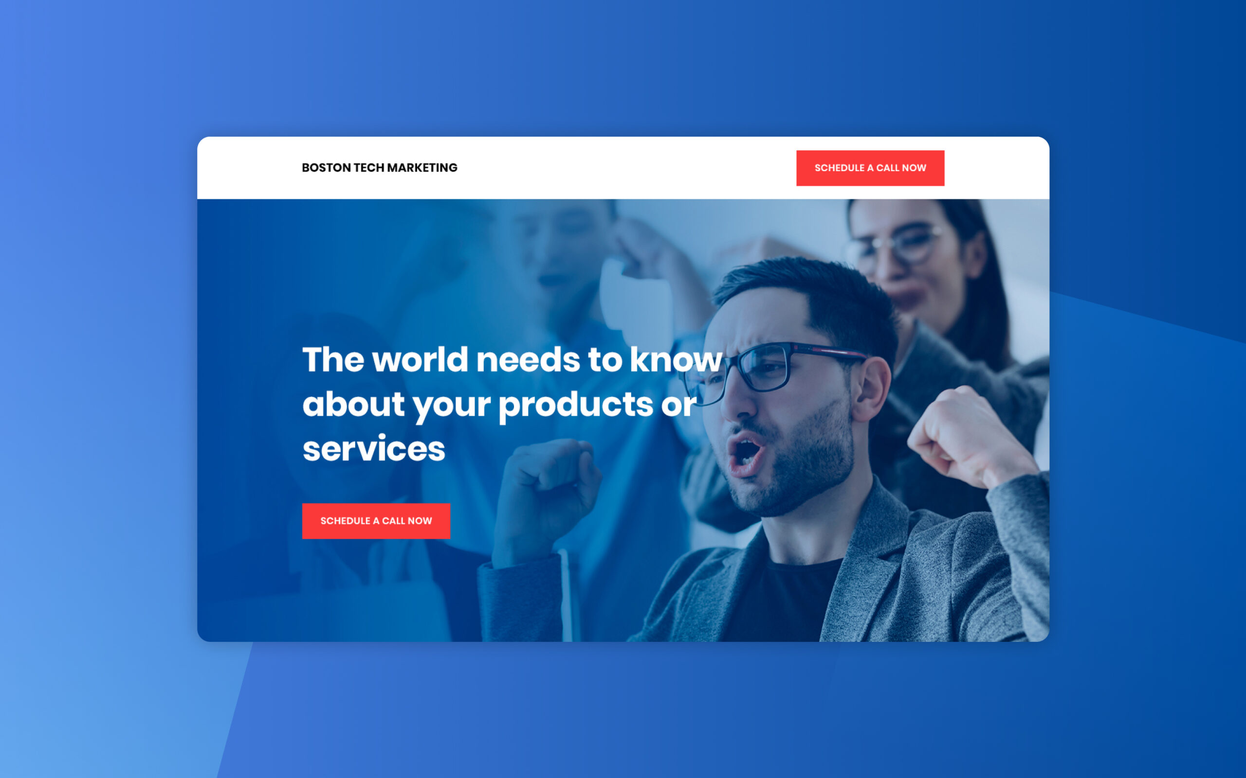
Main Header
For the main header on the homepage, I decided to place a powerful full-screen photo because I wanted to communicate a strong brand.
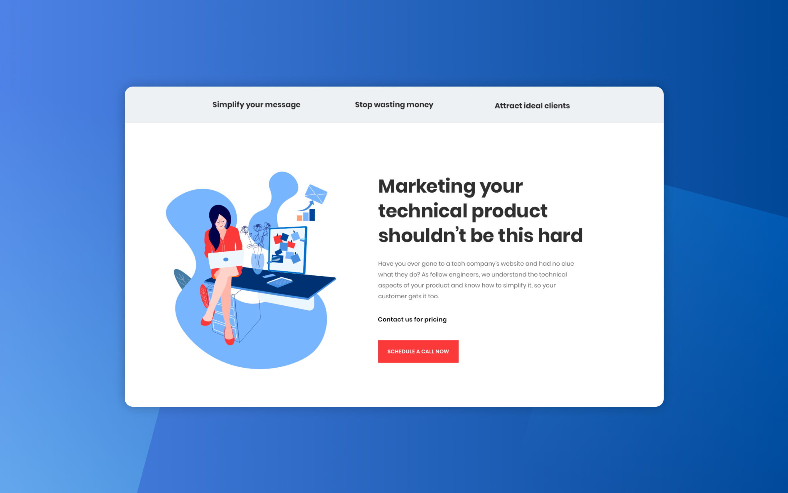
Intro Message
This section provides an introduction to the content of this landing page. A CTA button was placed below the text to make it easier for the user to contact the company.
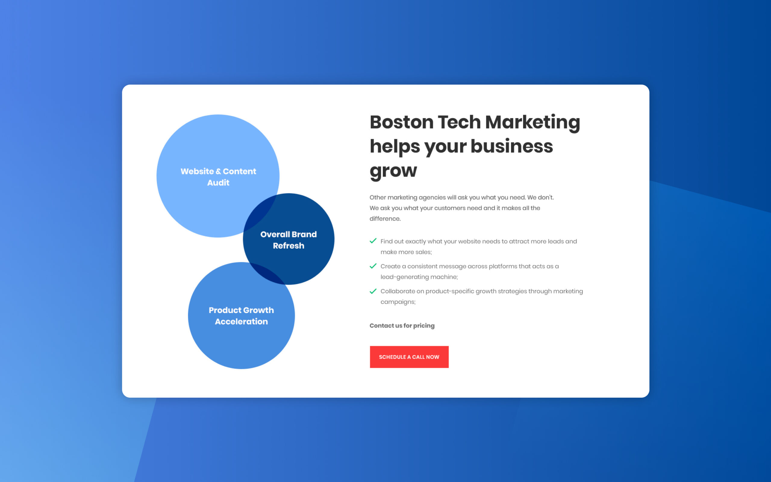
Benefits
In this section, I decided to mention all the benefits the company can provide to the user. I placed the most important contents on bullet points to be easier for the user to understand each topic.
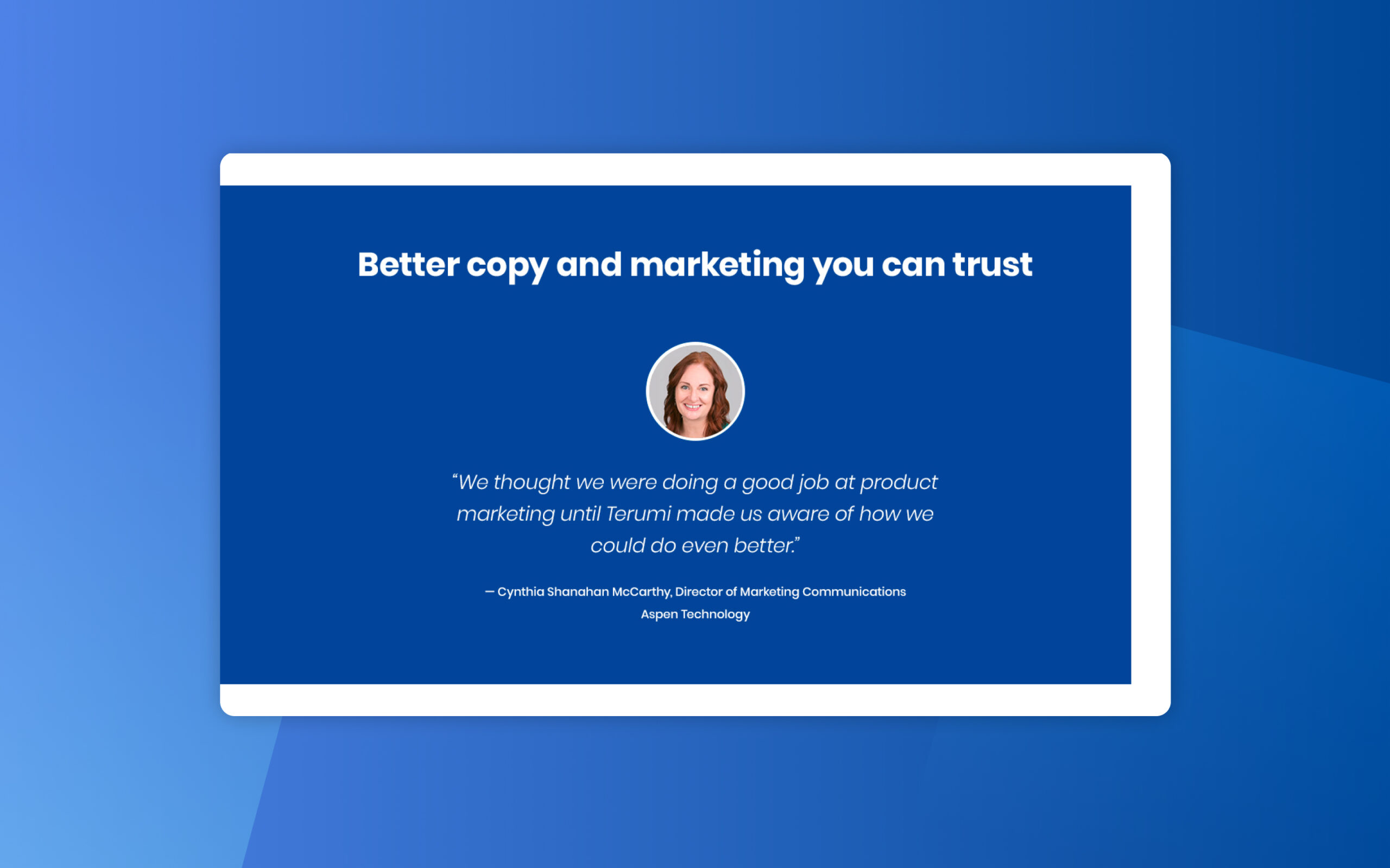
Testimonial
A testimonial from a client was used in this section to give more credibility to the brand and make the user more willing to request its service.
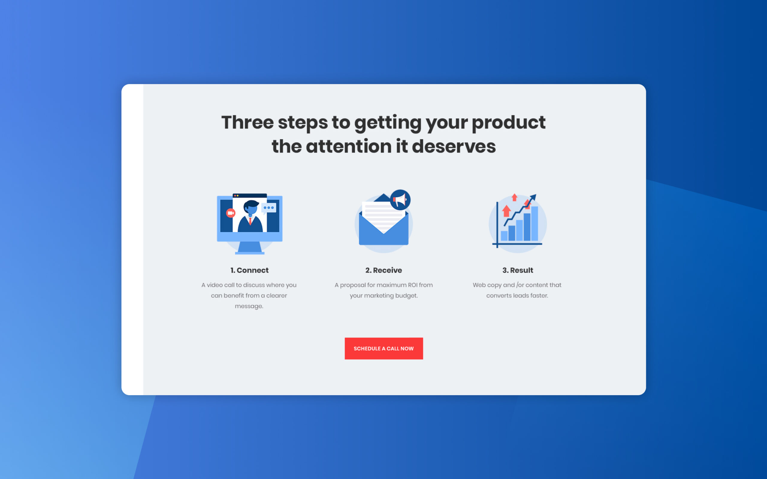
Process
A simple three-step process was included in this section to communicate how easy it will be to work with this company and get results.
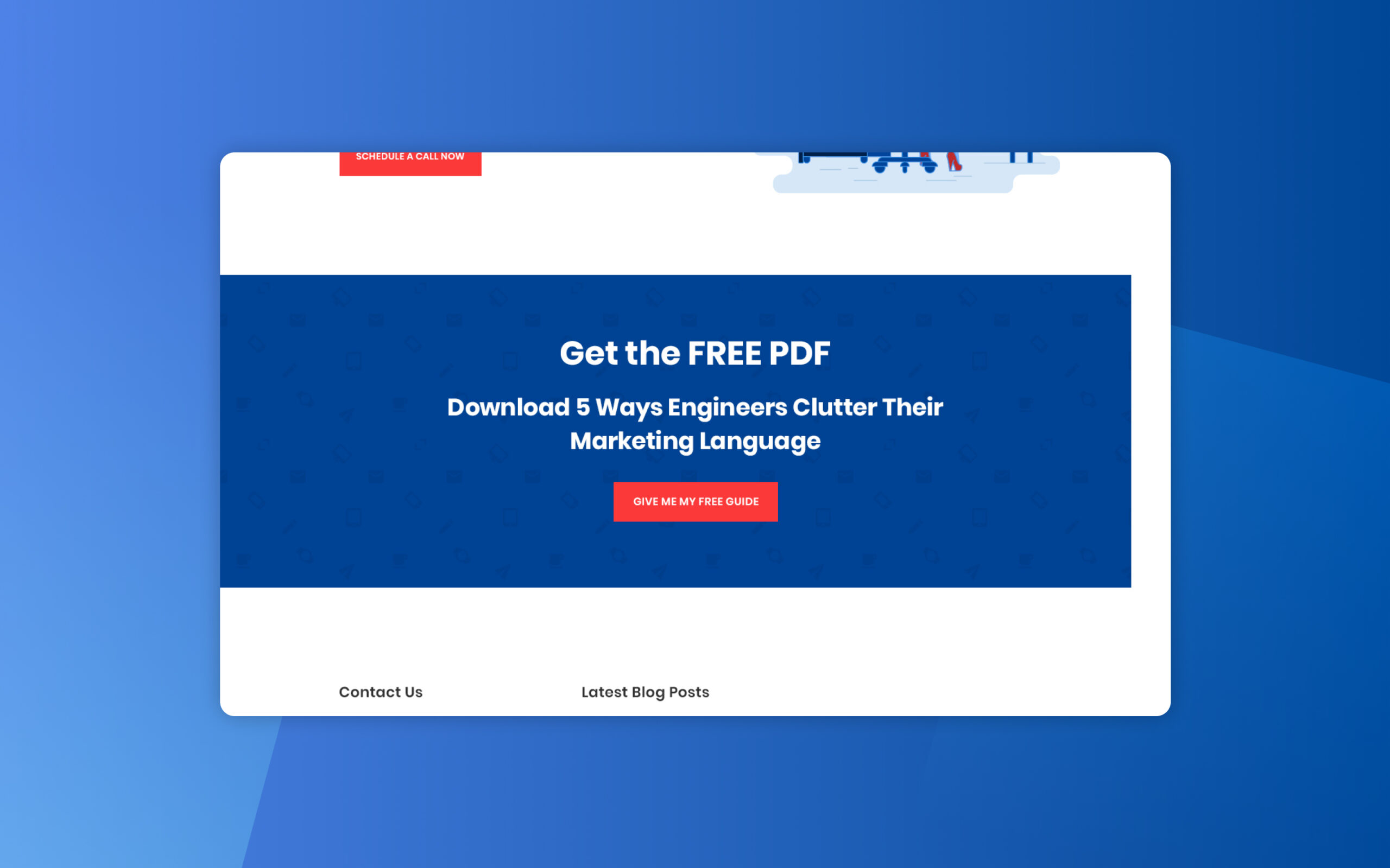
Download Free PDF
One of the last sections provides a PDF that can be downloaded by the user. To download this guide, the user needs to click on the “give me my free guide” button and fill the form. This data will be stored by the company for future sales and get new leads.
Learnings
When creating a landing page to get the user information to generate a lead, it’s important that the only ‘way out’ should be the button to contact the company. Telling a clear story about the service makes the user more interesting to contact them.