Create an e-commerce website to increase sales and bring more people to physical stores.
Context
ColchaoNet is a company that sells mattresses and bed suppliers. They requested a proposal for a new e-commerce website to increase their sales, bring more users to their physical stores and improve the relationship between the brand and the client.
Solution
The solution was to create a responsive and modern looking e-commerce website, with a simple navigation and user interface that allows the users to buy more products easily.
Project Goals
– Understand their market by performing a competitor analysis; – Create proto-personas to define target users; – Create user stories to define what will be the website contents; – Design an interactive prototype;
My Role
– Market research (competitor analysis); – Qualitative user research (proto-personas and user stories);
– Information architecture; – Low-fidelity wireframes;
– Med-fidelity wireframes.
Agency
Wingman
– UX Designer: João Pinheiro
– UI Designer: Manuel Crespo
1. Market and user research
Understanding the problem
With the information the company provided in the briefing, I decided to do market and user research to understand their competitors and user behaviour.
Competitor Analysis
By analysing and evaluating its competitors, the competitor analysis allowed me to understand their pain points. This method allowed me to find new solutions for problems and find out new opportunities. Below I describe a brief summary which I did for four websites:
Website A: MaxColchon
Key information should always be visible on every page (for instance: free delivery, warranty period, etc.). On this website, they should focus on less information to become easier for the user to remember. Also, a powerful image is extremely important to use on the homepage.
Website B: IKEA
Visual appealing images should be used to be more engaging with the user and create a stronger connection. Also, a simple grid makes navigation easy for the user.
Website C: Conforama
A user-friendly filter section should be created for the user to find all products in a quicker way. On this website, the filter section should have some elements larger to make it more accessible to the users.
Website D: IKEA
A clean and beautiful gallery should be used on the product page. Also, it’s extremely important to have a functionality to allow the user to know how many products are available in stock in each store.
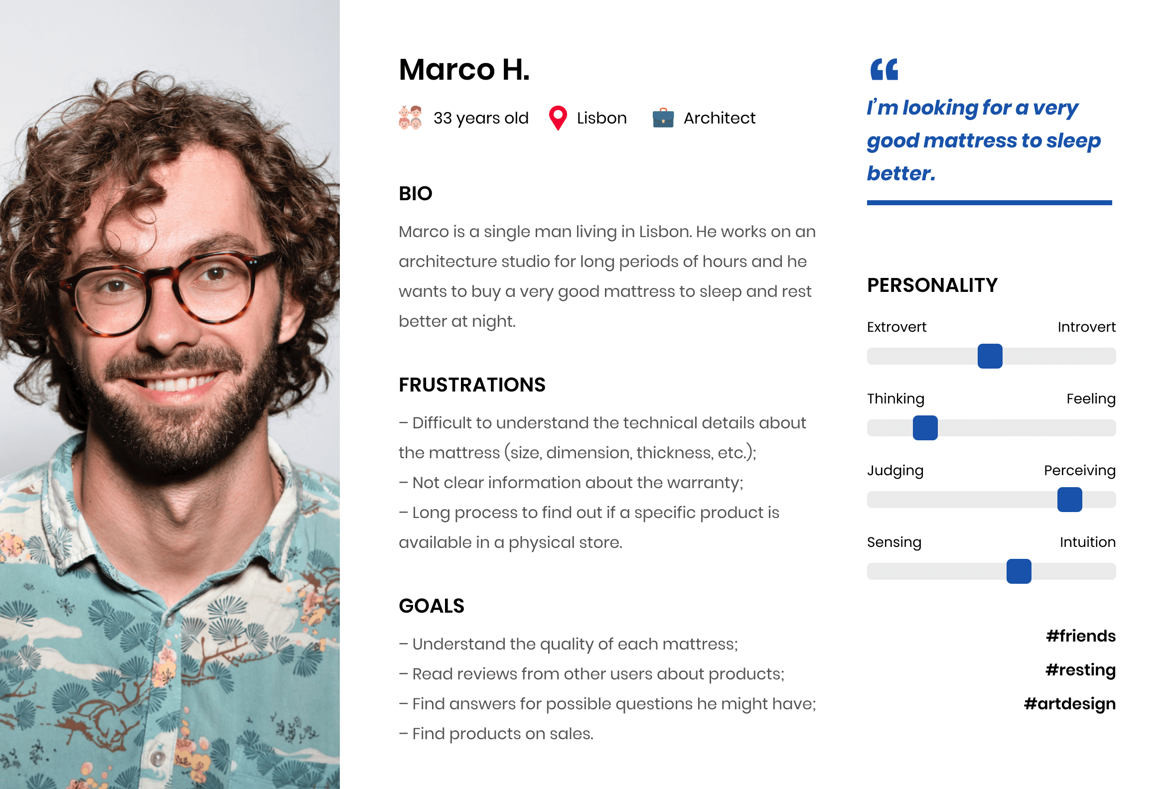
Proto-Persona
With the information I gathered from the previous research, I built three proto-personas to make it very clear who will be the target users for this digital product. Below I placed one of these proto-personas:
User Stories
I created user stories based on the proto-persona to understand all the contents this digital product should have. Below I placed six of them.
User Story #1
As a user, I want to find out how many products are available on a physical store.
Priority: High
User Story #2
As a user, I want to contact the customer services quickly (for instance, live chat).
Priority: High
User Story #3
As a user, I want to read the reviews from other users about products.
Priority: High
User Story #4
As a user, I want to know the warranty period and how much cost to deliver each product.
Priority: High
User Story #5
As a user, I want more detailed filters to find out specific products.
Priority: High
User Story #6
As a user, I want to see videos explaining the difference between each type of mattress.
Priority: Meddium
2. Ideation
Designing the solution
In the second phase, I draw low- and med- fidelity wireframes and then it was created the visual design.
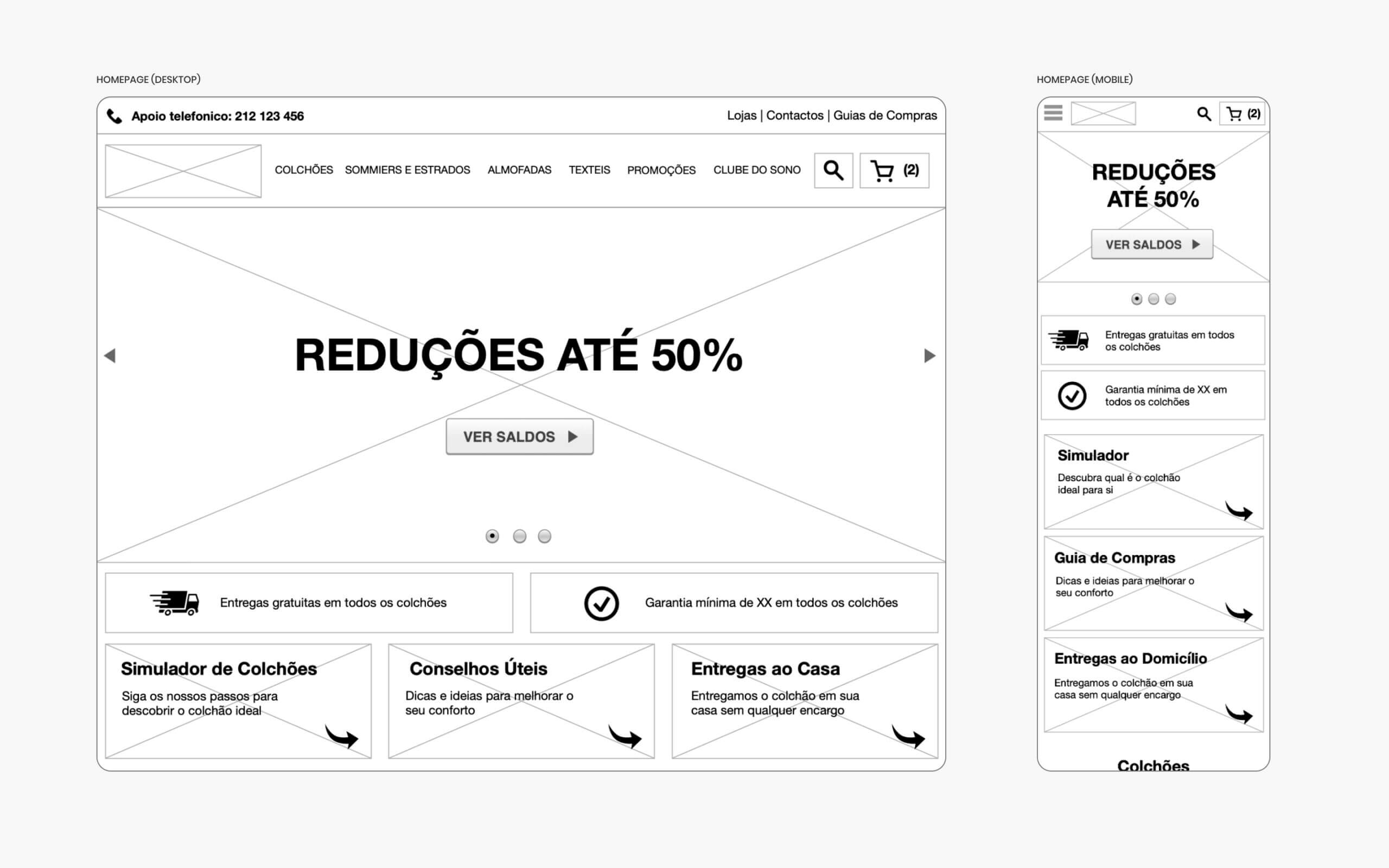
Med-Fidelity Wireframes
When I was sketching all low-fidelity wireframes, I structured all contents that should be on each section. After that, I created the med-fidelity wireframes for a more clear understanding of the user interface.
Visual Design
For the visual design of this digital product, the goal was to communicate a clean layout with a focus on specific elements that would promote sales.
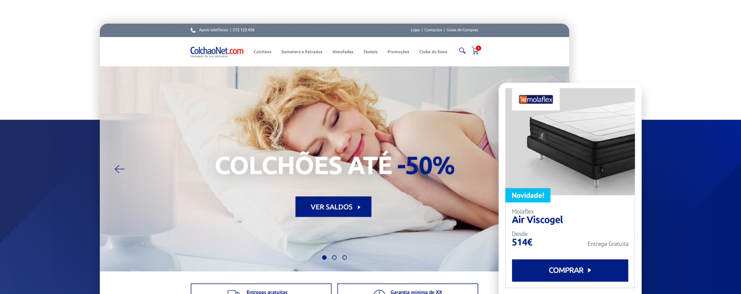
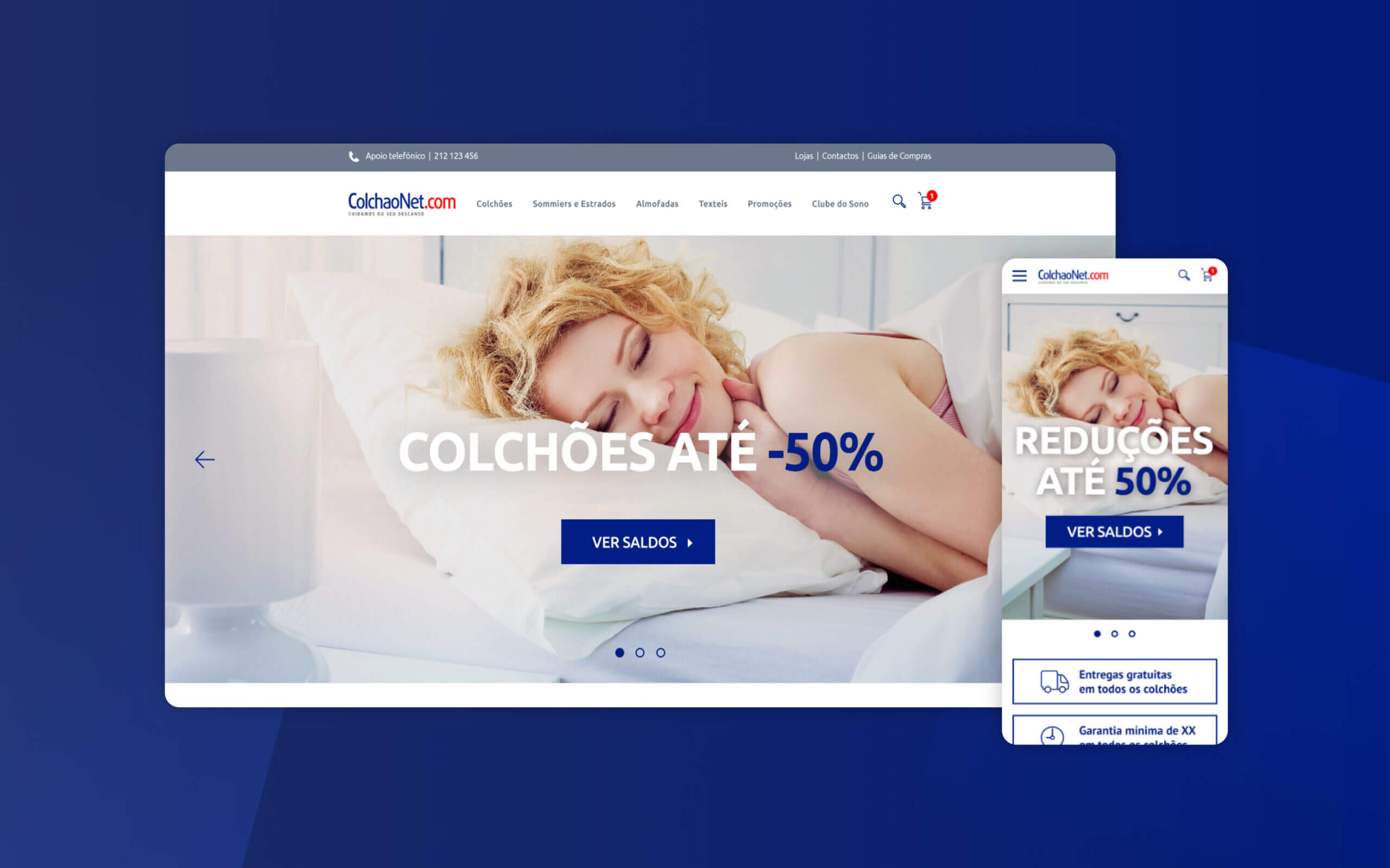
Homepage: Main Banner
For the main banner on the homepage, it was placed a powerful image that is related to the subject of the brand. One of the main requests for the homepage was to have quick access to promotions and for that reason, it was placed a CTA button below the main title.
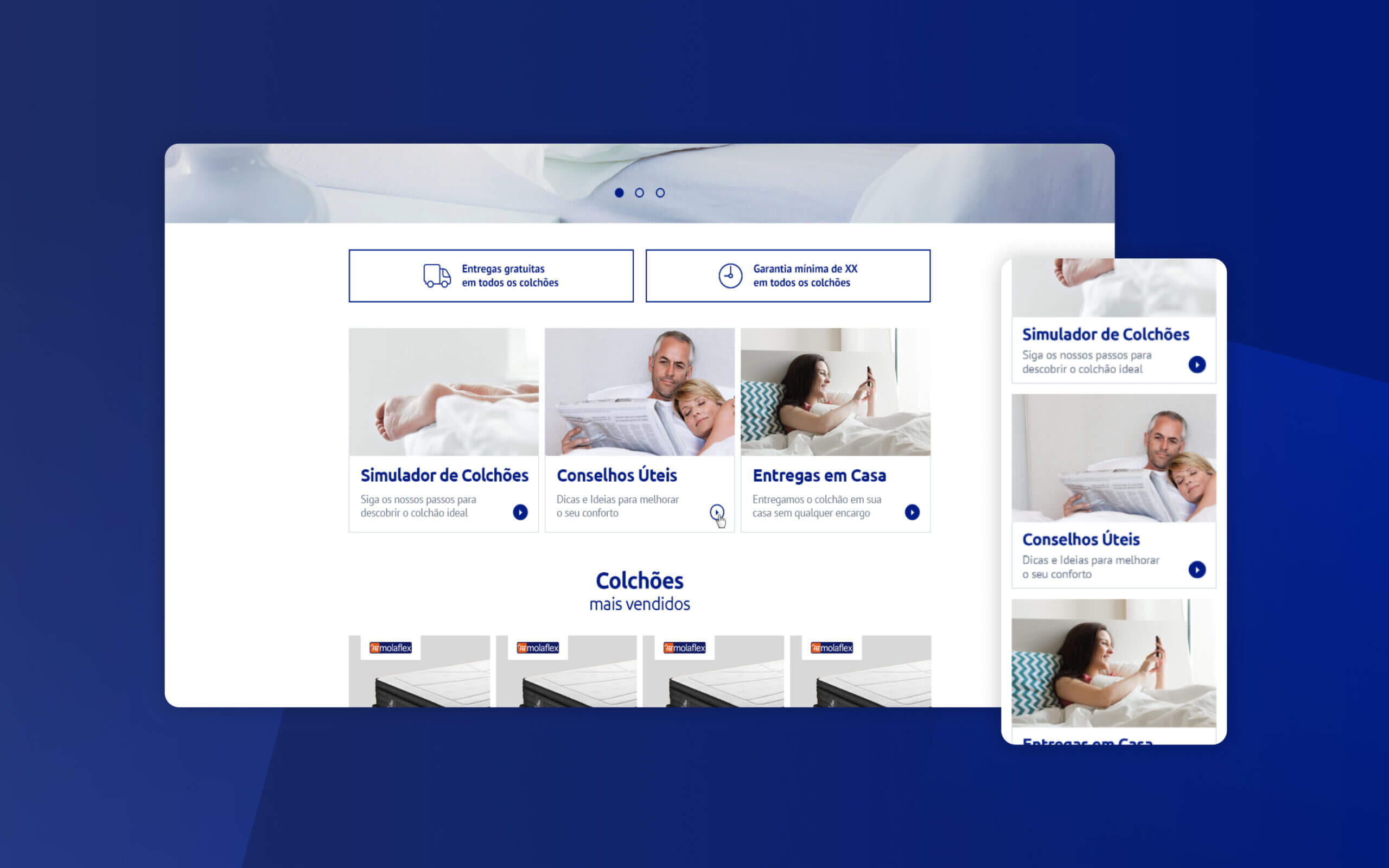
Homepage: Help Section
This section is below the main banner to help the user to find out the perfect mattress. Based on the research, this section was divided into three areas: mattress simulator, useful advices and delivery.
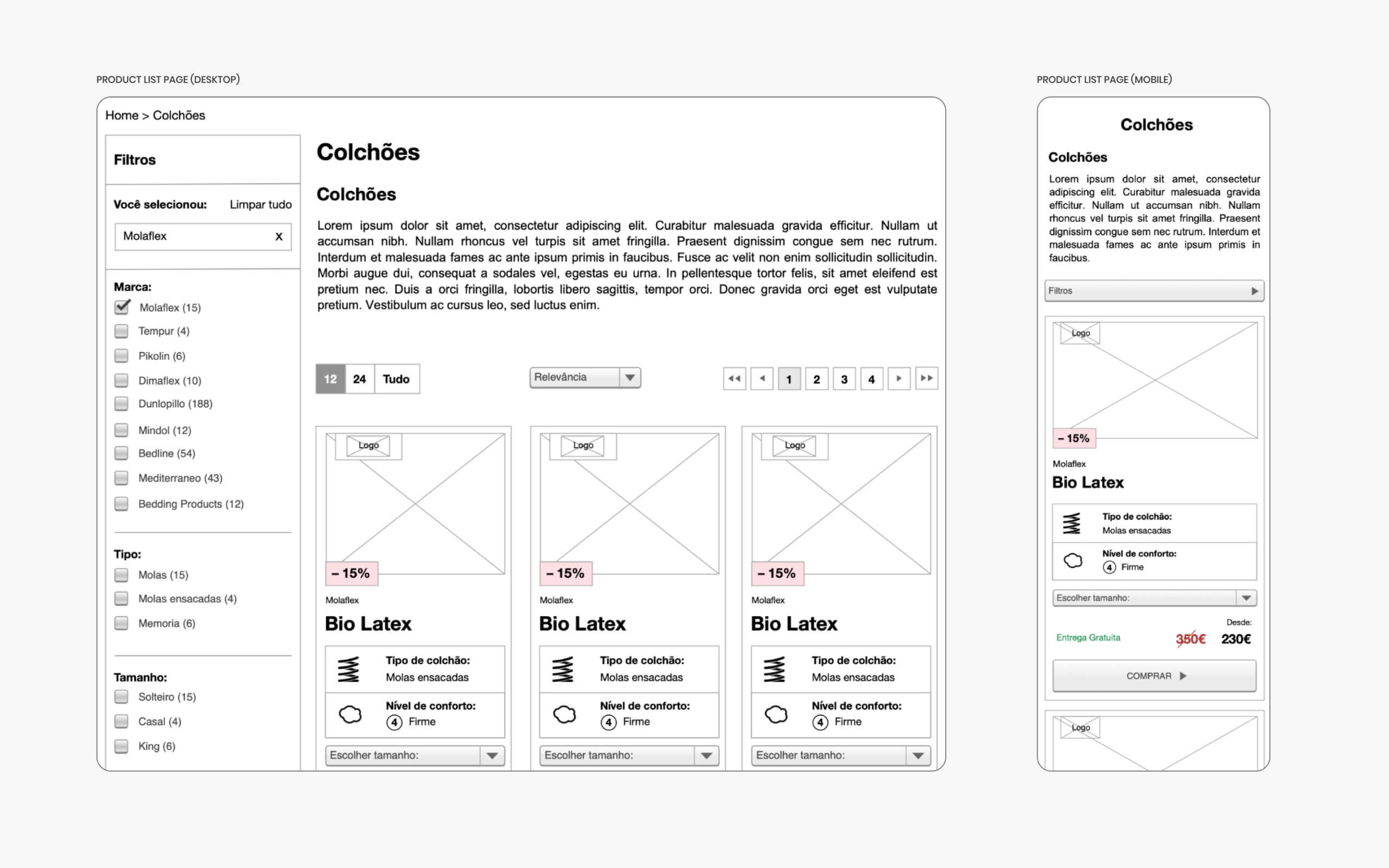
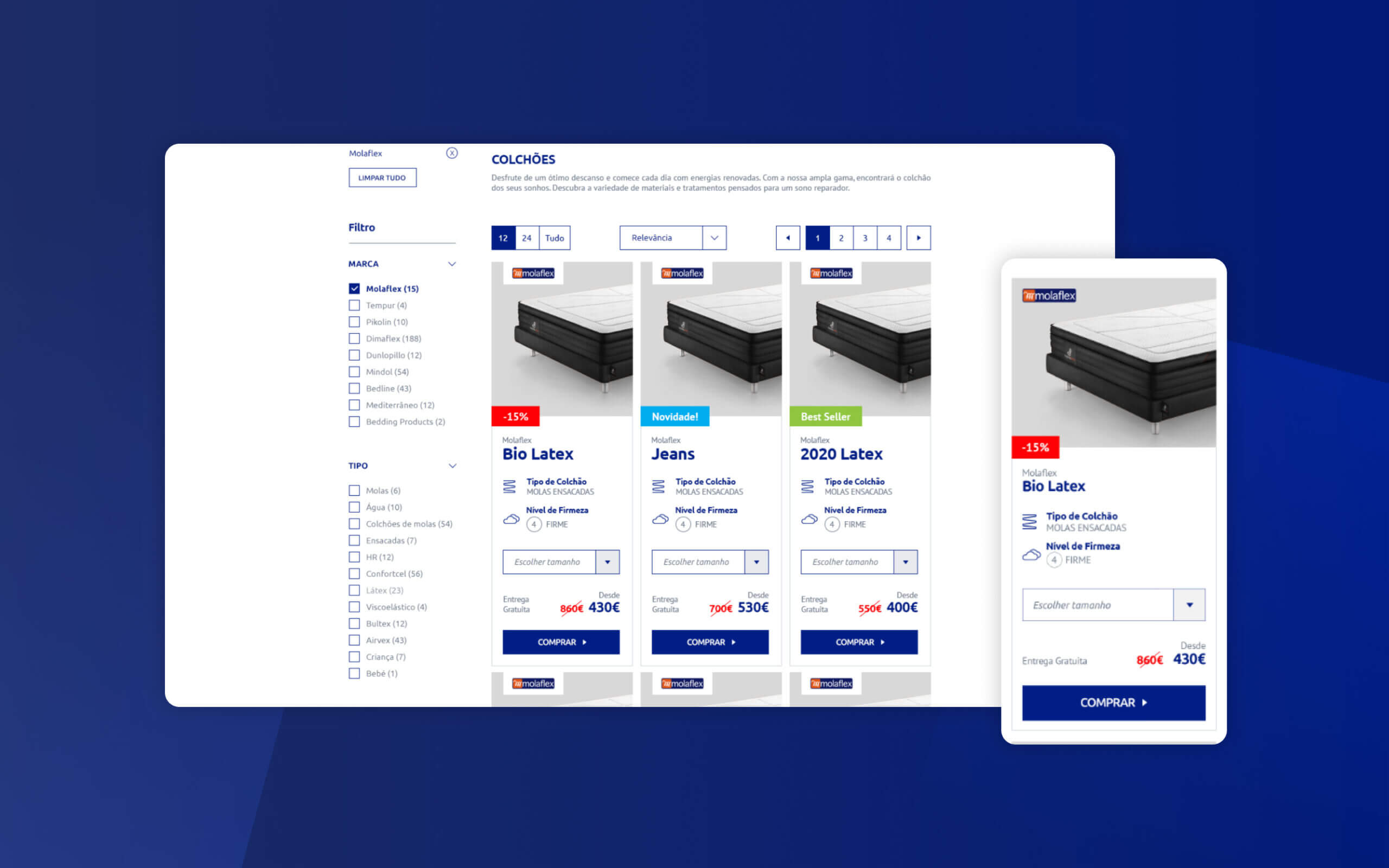
Product List Page
The two main areas on the product list page are filters and products. Filters were organized by how much item is important. For each product, it was added a label to promote sales (Best Seller, New! and –XX%), it was described the mattress style and it was showed the price after the discount.
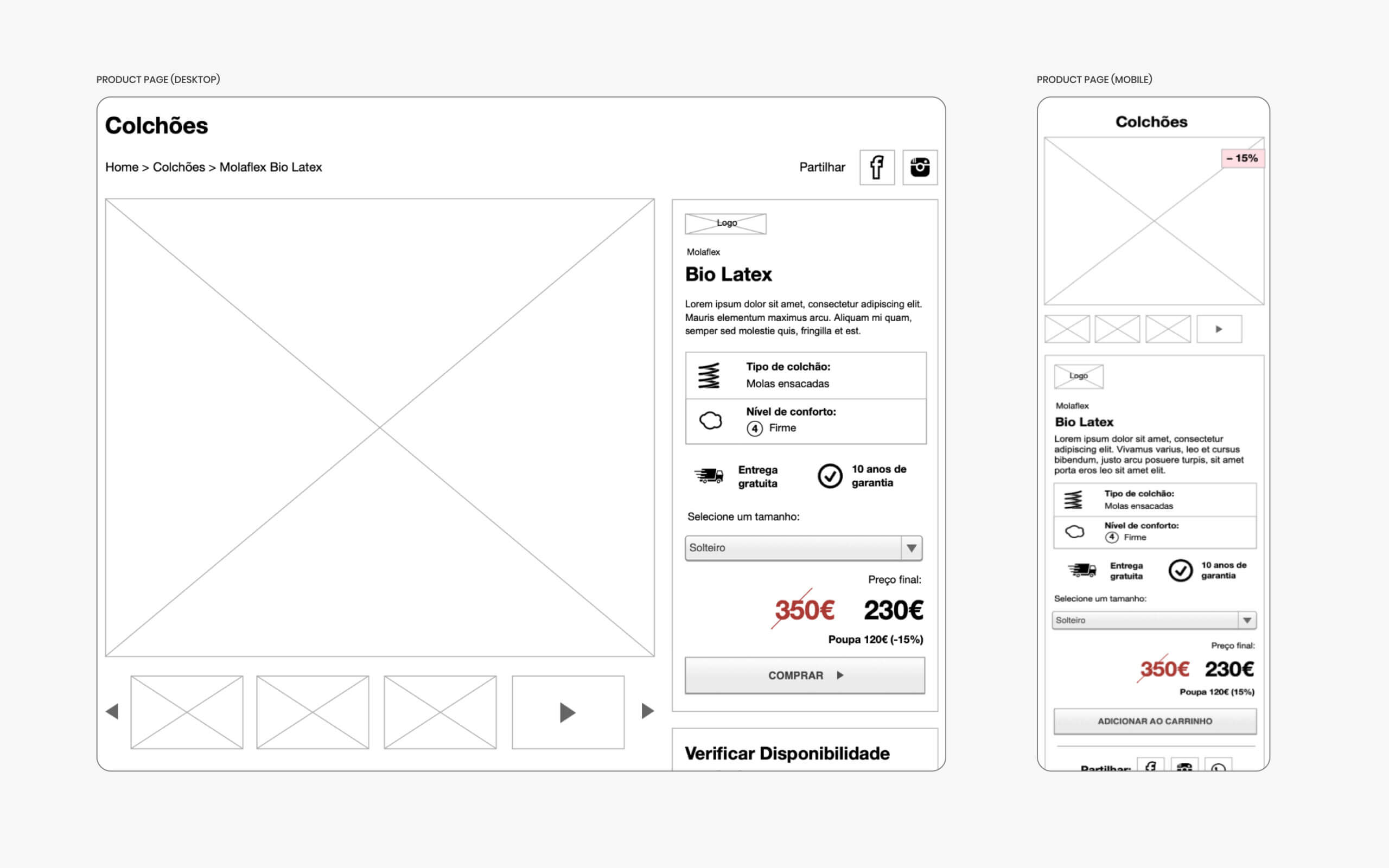
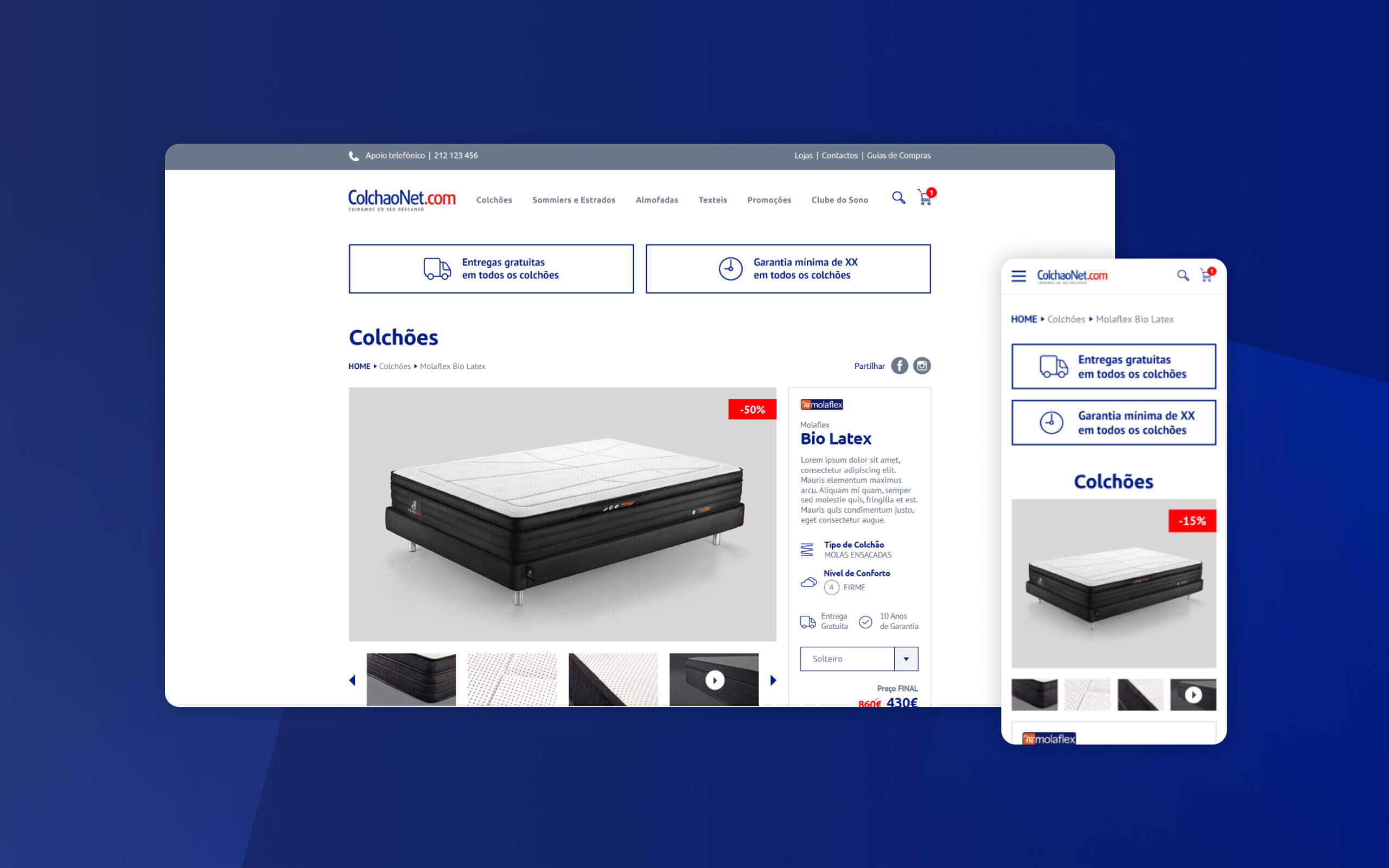
Product Page: Gallery and Price
A gallery of beautiful and professional photos and videos were added to each product. A section with details about the product was displayed in a clear way with the most important elements I learned from the research.
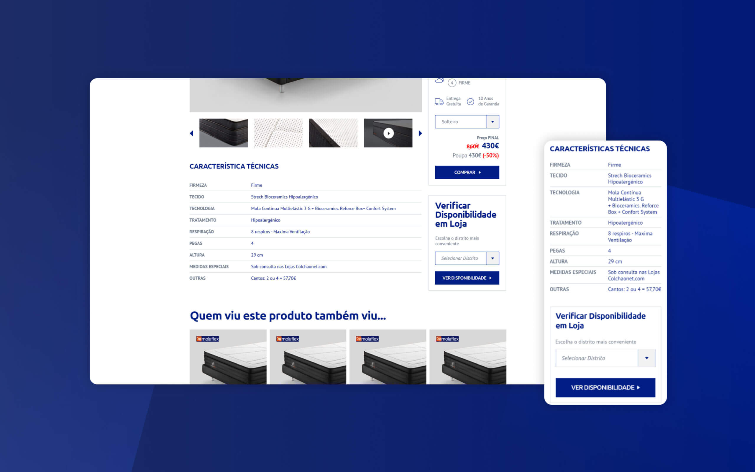
Product Page: Technical Details and Stock Availability
Below the gallery was added a list with all technical details and a section to find out the stock that is available in each store.
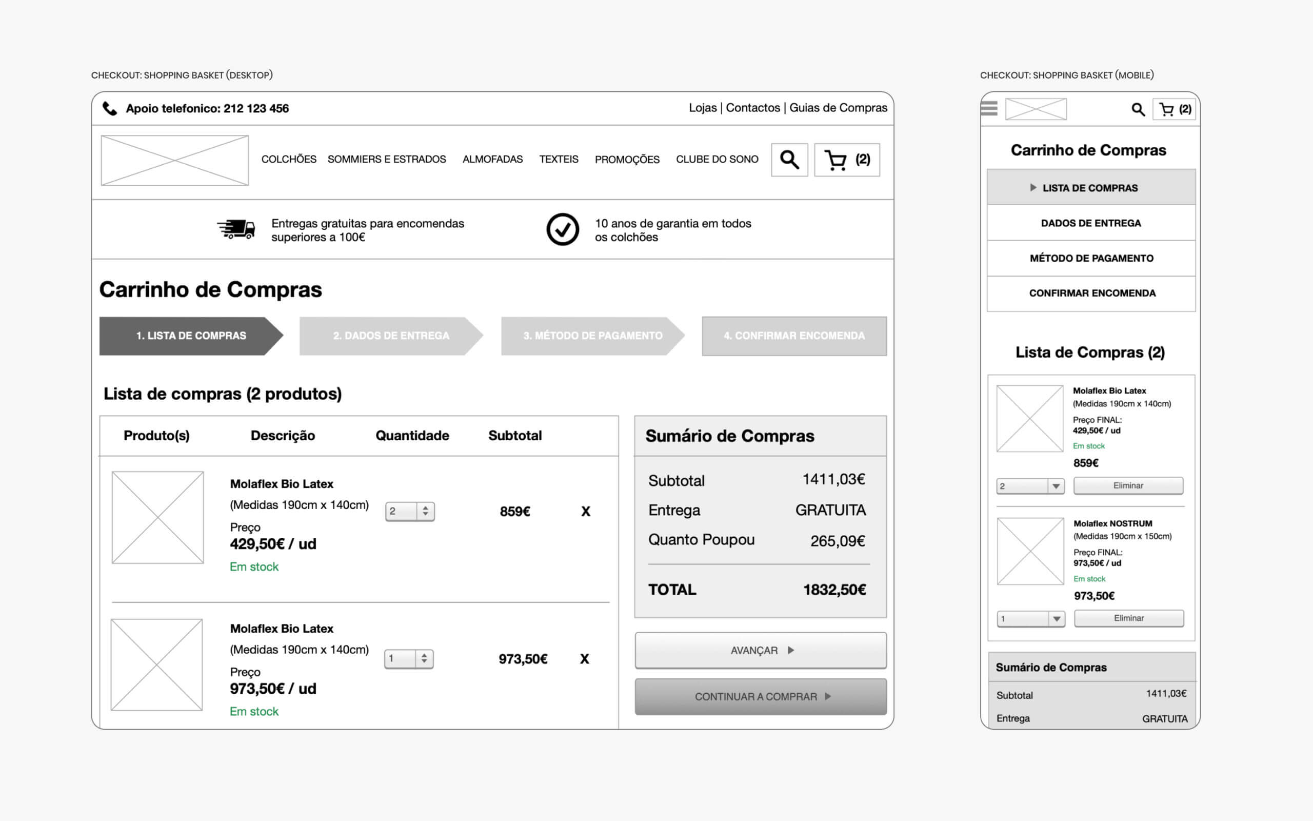
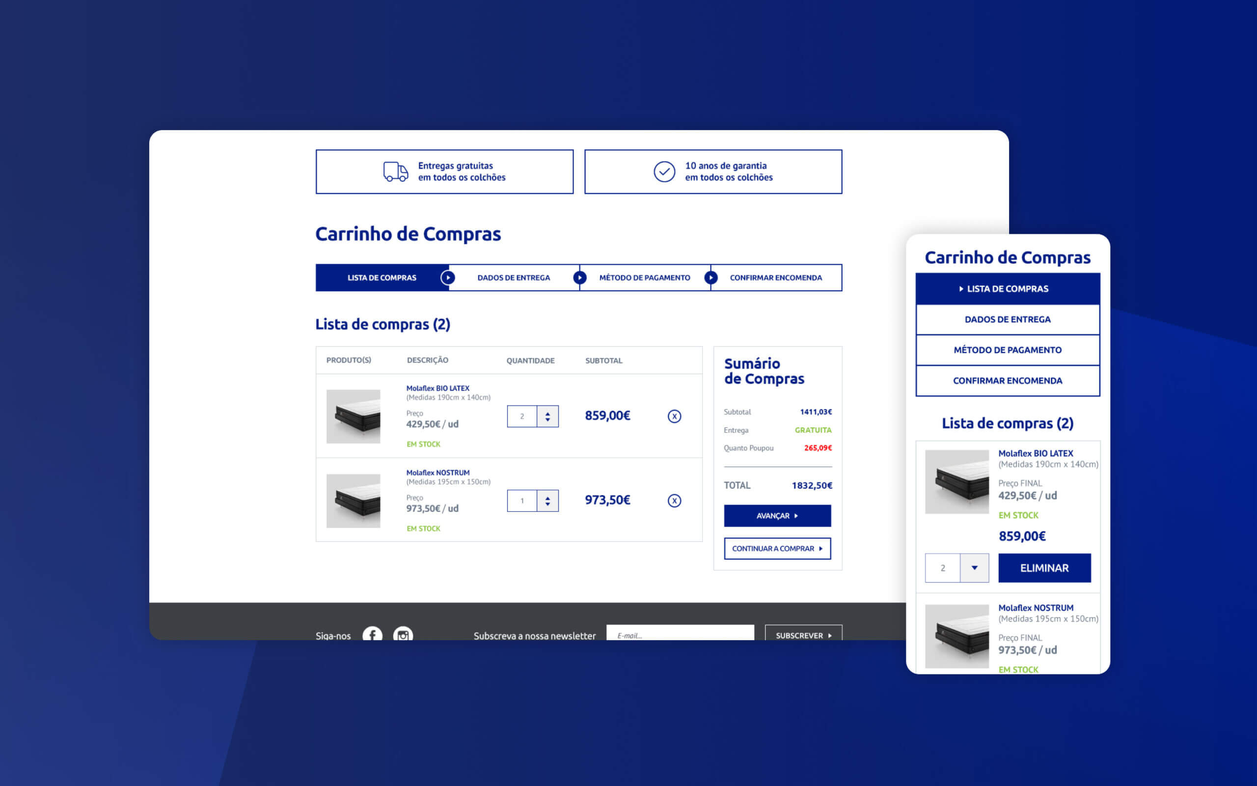
Checkout: List of Products
A clear list of all the products the user wants to buy was added to this page. It shows if a product is available, what is the size, price and quantity that the user wants to buy. It was also highlighted in red how much the user saved.
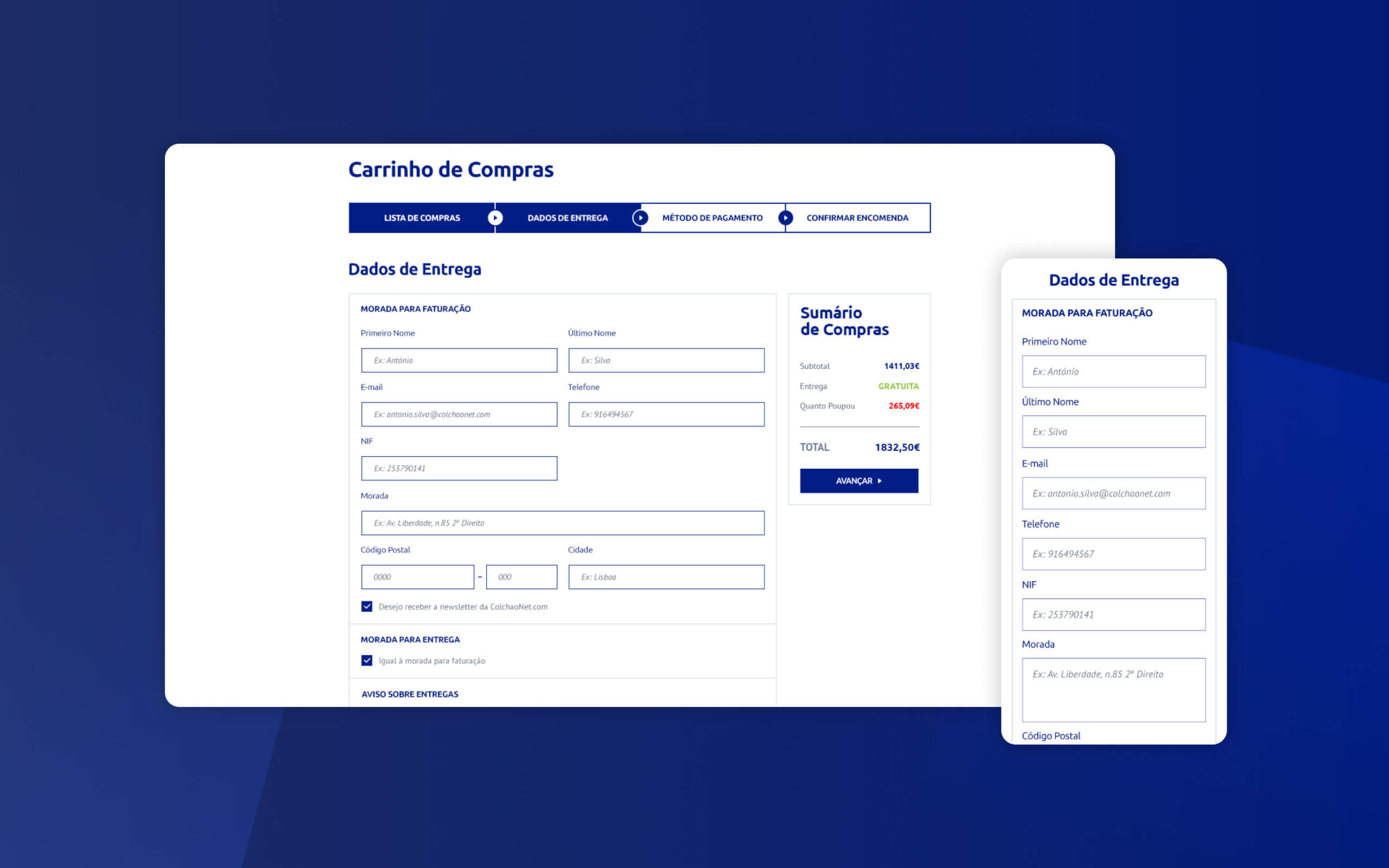
Checkout: Delivery Details Form
The delivery details form only asks for the information that is necessary for the user to finish his purchase.
Learnings
Making the navigation flow extremely simple is very important to increase sales on any e-commerce website. Also, understand what the user is looking during the qualitative research allowed me to build better sections for the information architecture of this website. Finally, a clean and professional image makes the whole brand stronger.