Create a new website to make new parents interested in preserve stem cells from their newly born babies.
Context
Crioestaminal is a company that preserves stem cells from newly born babies so they can be used to treat future diseases. Their actual website was outdated and they requested a new mobile-friendly version.
Solution
The solution was to design a new website with clear navigation between pages. The information architecture was all reviewed and organized in a way that would be more clear for the user to reach the goal more quickly. The visual design was also updated with a flat design style to communicate a more modern look.
Project Goals
– Gather insights from their competitors and users; – Design a user-friendly responsive website (desktop and mobile); – Perform usability testing to collect insights and improve the digital product.
My Role
– Market research (competitor analysis); – User research (interviews and personas); – Information architecture;
With the information the company provided in the briefing, I decided to do market and user research to understand their competitors and user behaviour.
Competitor Analysis
By analysing and evaluating its competitors, the competitor analysis allowed me to understand their pain points. This method allowed me to find new solutions for problems and find out new opportunities. Below I describe a brief summary which I did for four websites:
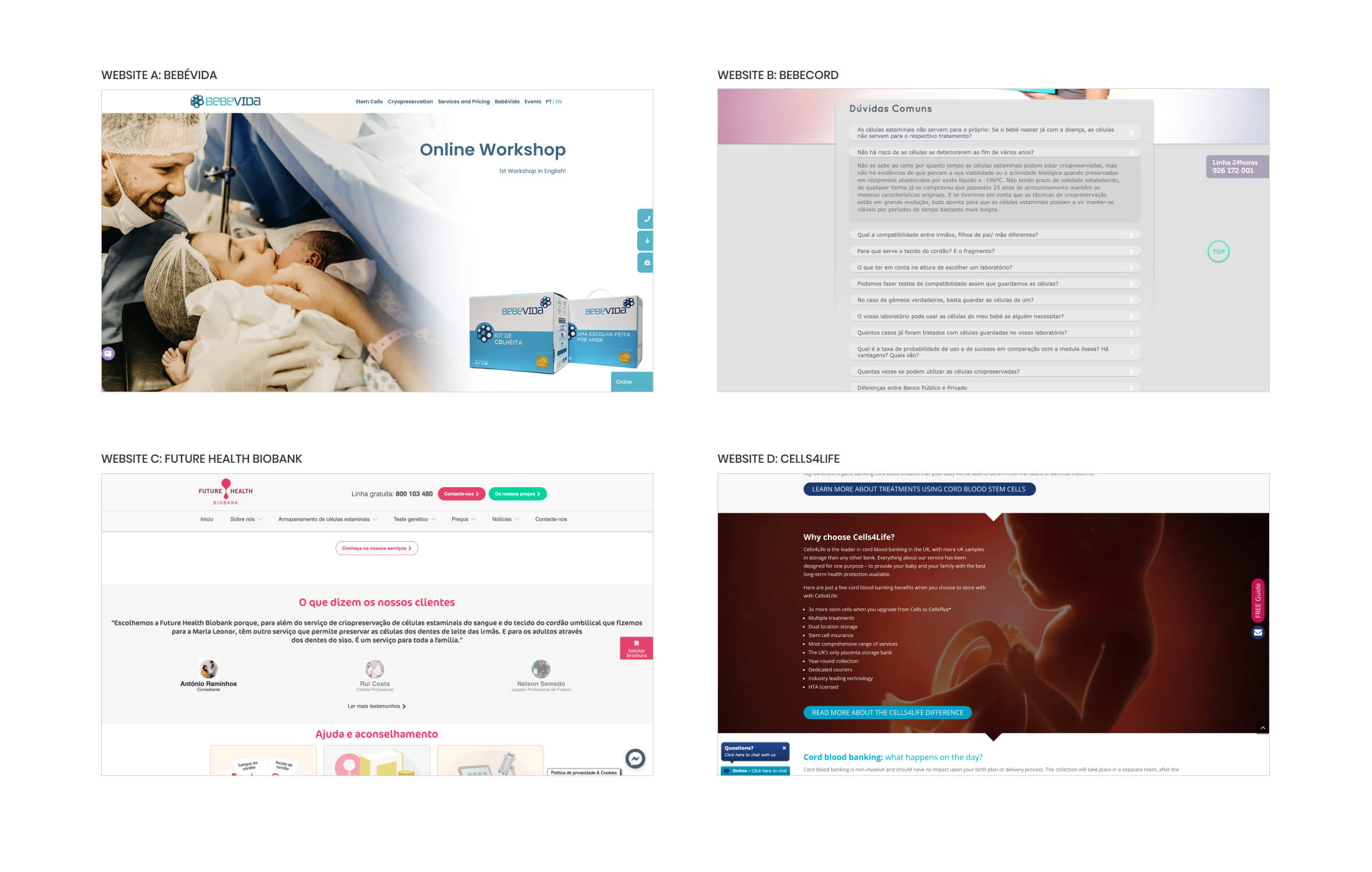
Website A: Bebévida
The image that is on the main header is extremely important because it’s the first contact with the user. On this website, the main image is very strong although the main title should be larger and with a more engaging message, and there should be a CTA button (for instance, invite the user to receive the kit at home).
Website B: Bebecord
Frequency Asked Questions is a very important section to help users get their answers quickly. Although, in this website the visual is not very appealing and this section should be divided into different subjects.
Website C: Future Health Biobank
To make the website more reliable, it’s important to use testimonials from previous users that have used the product and were happy with the results. On this website, photos should be larger to create more impact and it should be clear which testimonial belongs to each user.
Website D: Cells4life
A list of advantages is always a great method to build trust with the user. On this website, they have chosen a powerful image although each advantage should have an icon to make it more clear and quicker for the user to understand.
Interviews
I conducted interviews with users to find out new insights which allowed me to create a better digital product. I asked five participants the following questions for this qualitative research:
1. How was your experience when you visited the website on the last time? 2. What are the positive and negative points you see on this website? 3. What are the most appealing elements on this website? 4. What other companies do you know that offer the same service (preserve stem cells)?
These are some of the results I got from the interviews:
2
user mentioned their experience wasn’t great because it took too much time to find the content they were looking.
4
users mentioned it’s very easy to find the contact details but it’s difficult to fill the form to request the kit.
5
users mentioned they would like to see more videos explaining the whole process (because it’s a difficult subject).
3
users mentioned the illustrations and the main colour (orange) are very appealing.
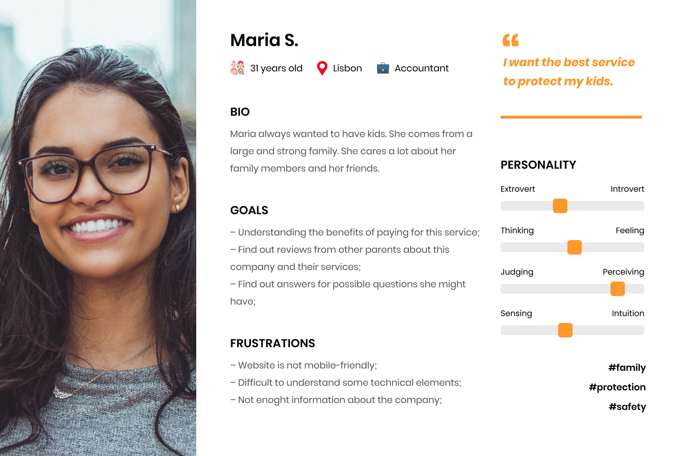
Persona
With the information I gathered from the interview, I built three personas to make it very clear who will be the target user for this digital product. Below it’s one of the personas.
User Stories
I created user stories based on the user research to understand all the new contents this digital product should have. Below I highlighted three of them.
User Story #1
As a user, I want to know what are the benefits of preserve my stem cells.
Priority: High
User Story #2
As a user, I want to read reviews from other parents that purchase this service.
Priority: High
User Story #3
As a user, I want to explore typical questions parents usually have.
Priority: High
2. Ideation
Designing the solution
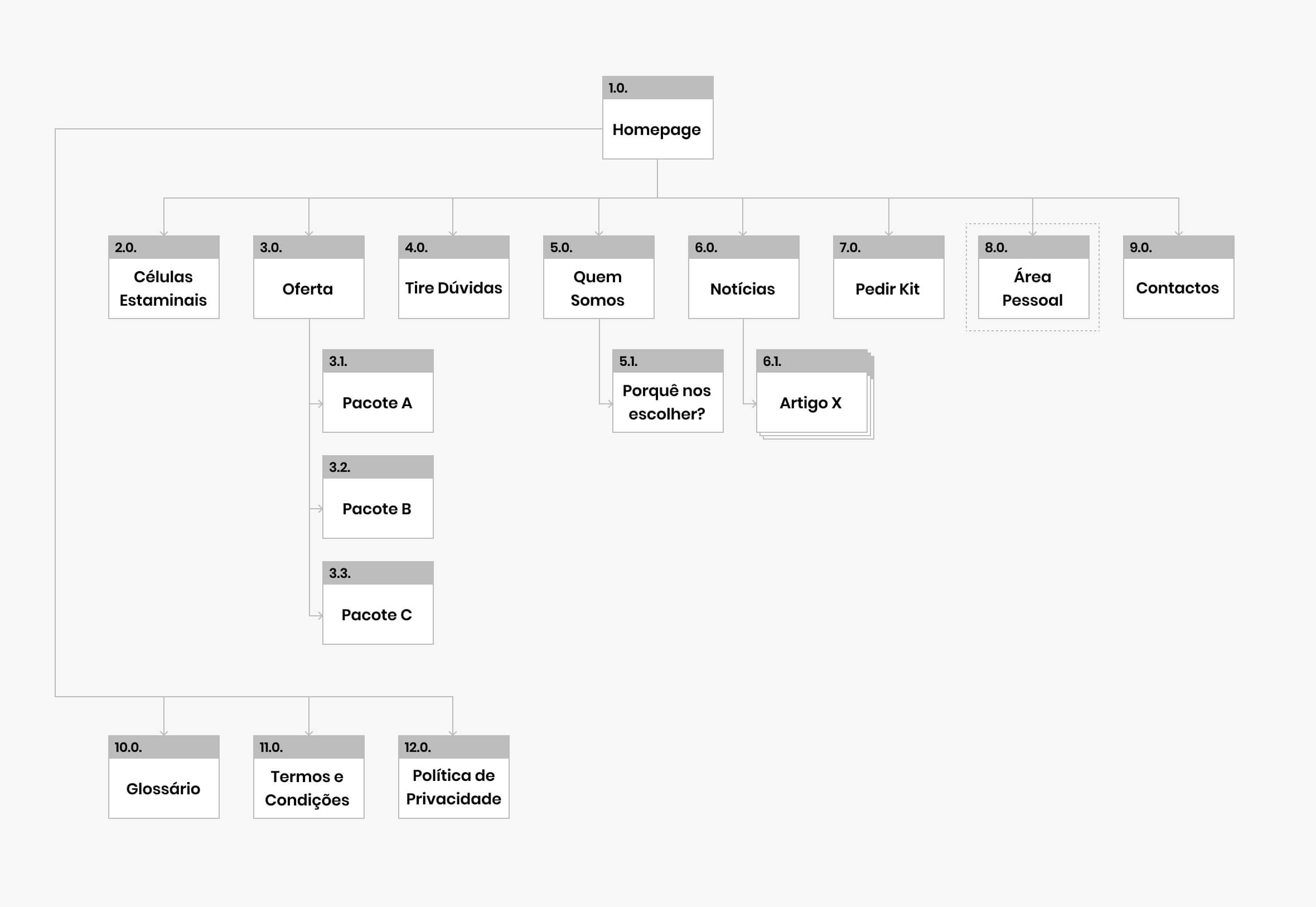
In the second phase, I started by creating the website’s sitemap to understand how many pages there will be. Then I draw all the low-fidelity wireframes and I created the visual design based on the brand identity.
Sitemap
The previous research allowed me to build the sitemap with all hierarchies and connections between each page.
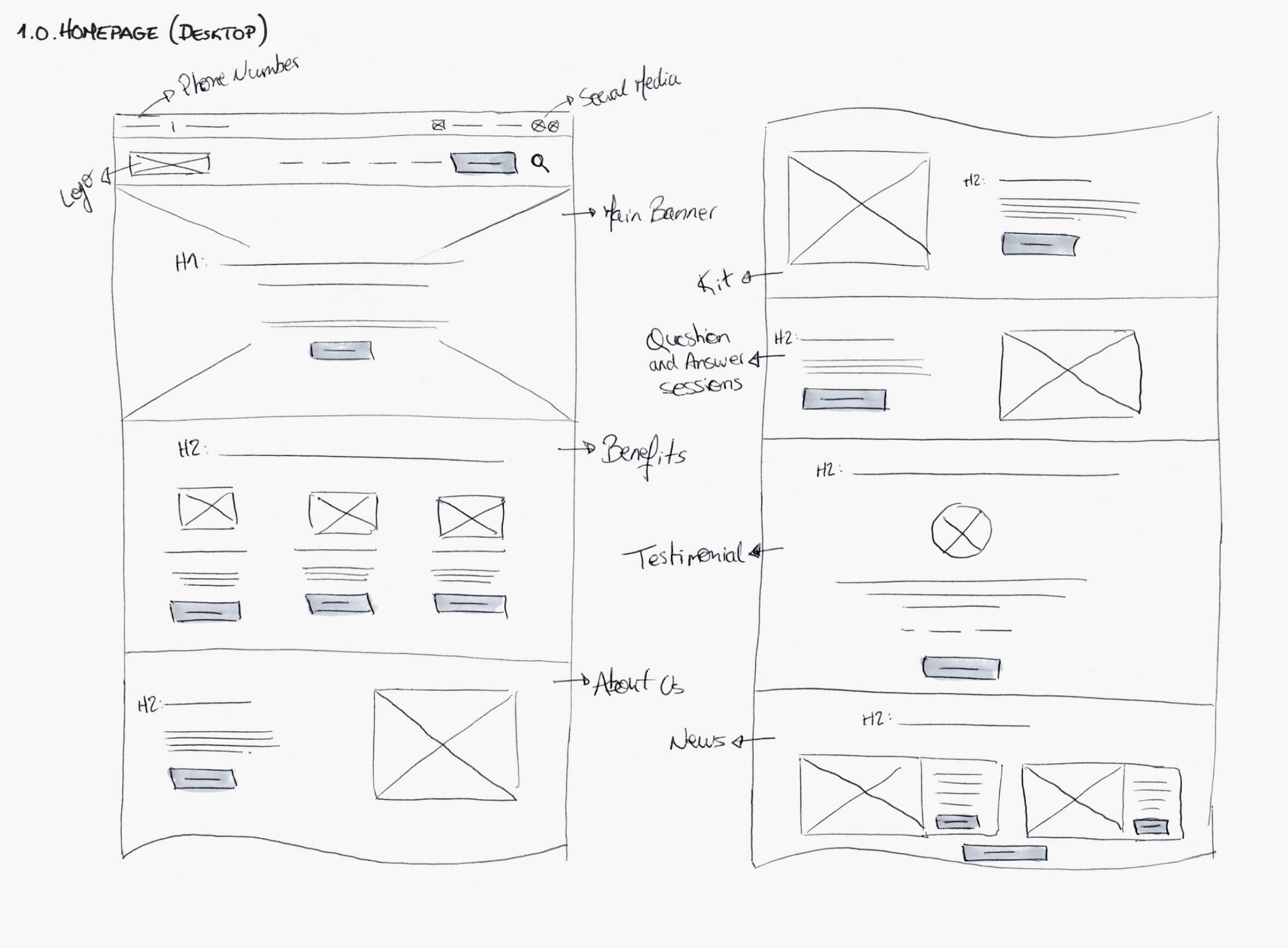
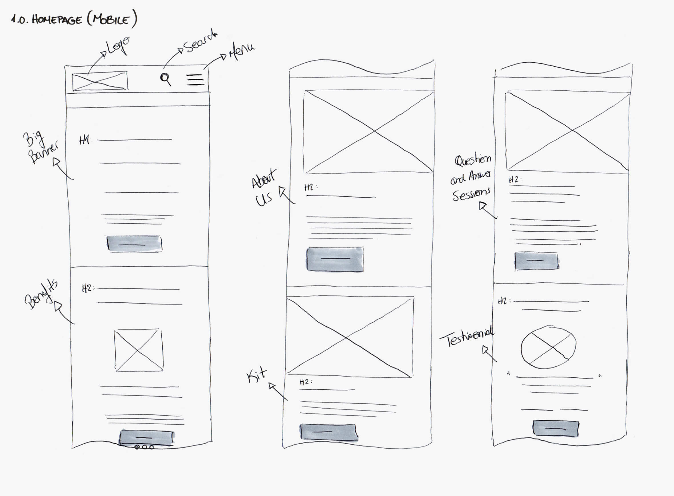
Low-Fidelity Wireframes
I started by sketching all low-fidelity wireframes on paper because it allowed me to focus more on the design of the information architecture for each page. Each page was designed for desktop and mobile.
Visual Design
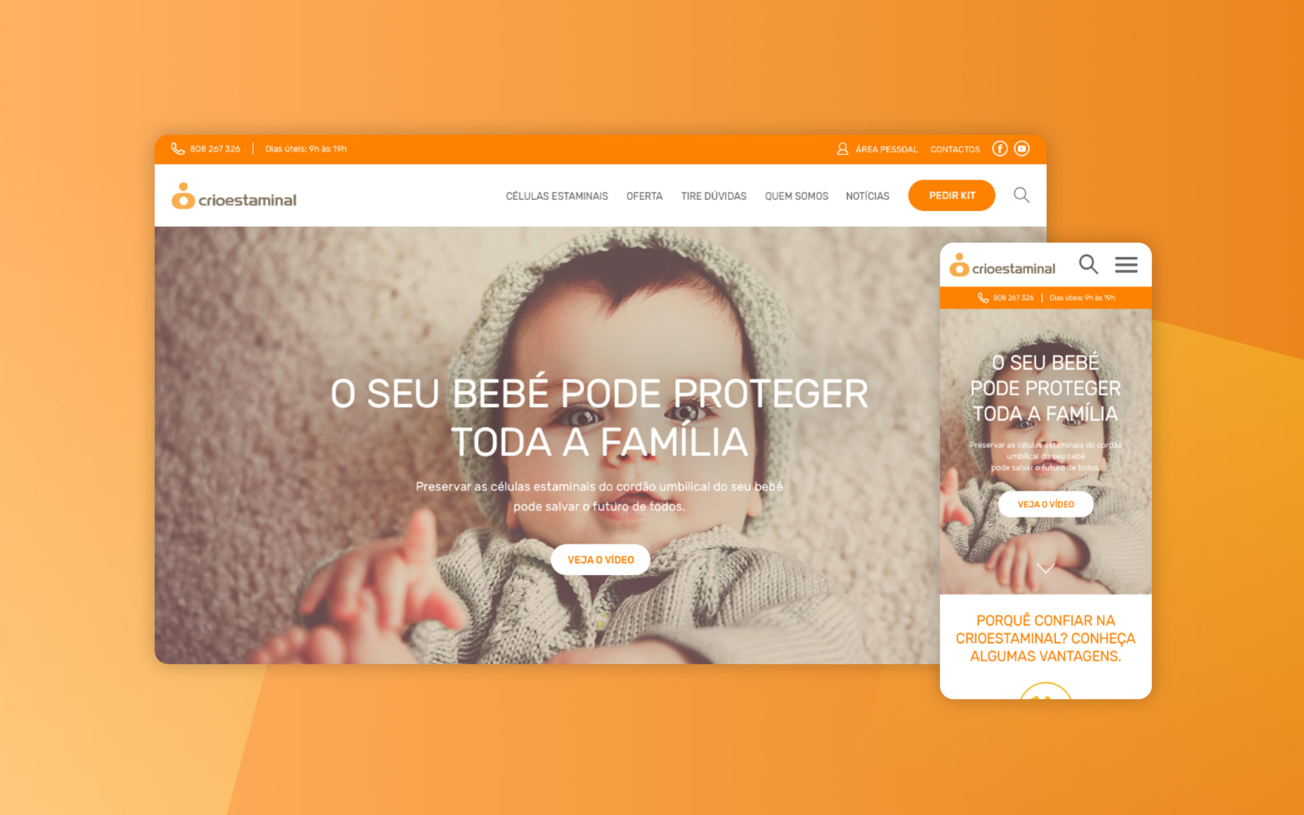
For the visual design of this digital product, I wanted to communicate a very modern, strong and clean concept. For the font I decided to use a rounded style because it’s more related with the subject of babies and also it’s a more friendly typeface. For the colours, I decided to use the main orange from their brand guidelines and white has the main background colour.
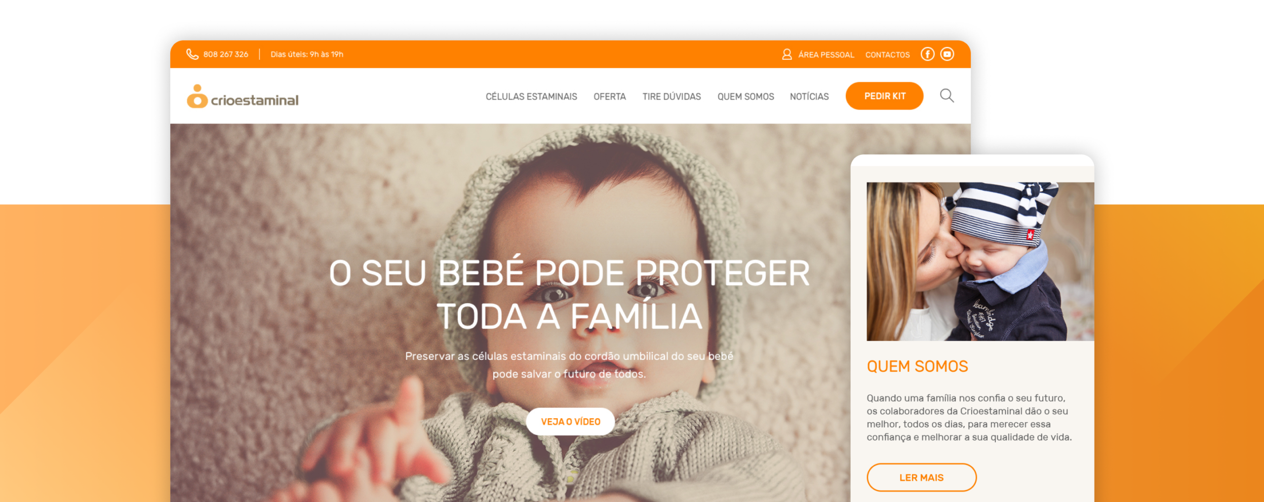
Main Header
A photo of a friendly baby looking at the eyes of the user directly, was used with the goal to get more attention for the brand’s main service (preserve stem cells). Also a clear headline (O seu bebé pode proteger toda a família = Your baby can protect your family) was used to communicate the same message.
Advantages
Three main advantages were placed below the main banner to communicate with the user why they should trust this company and their services.
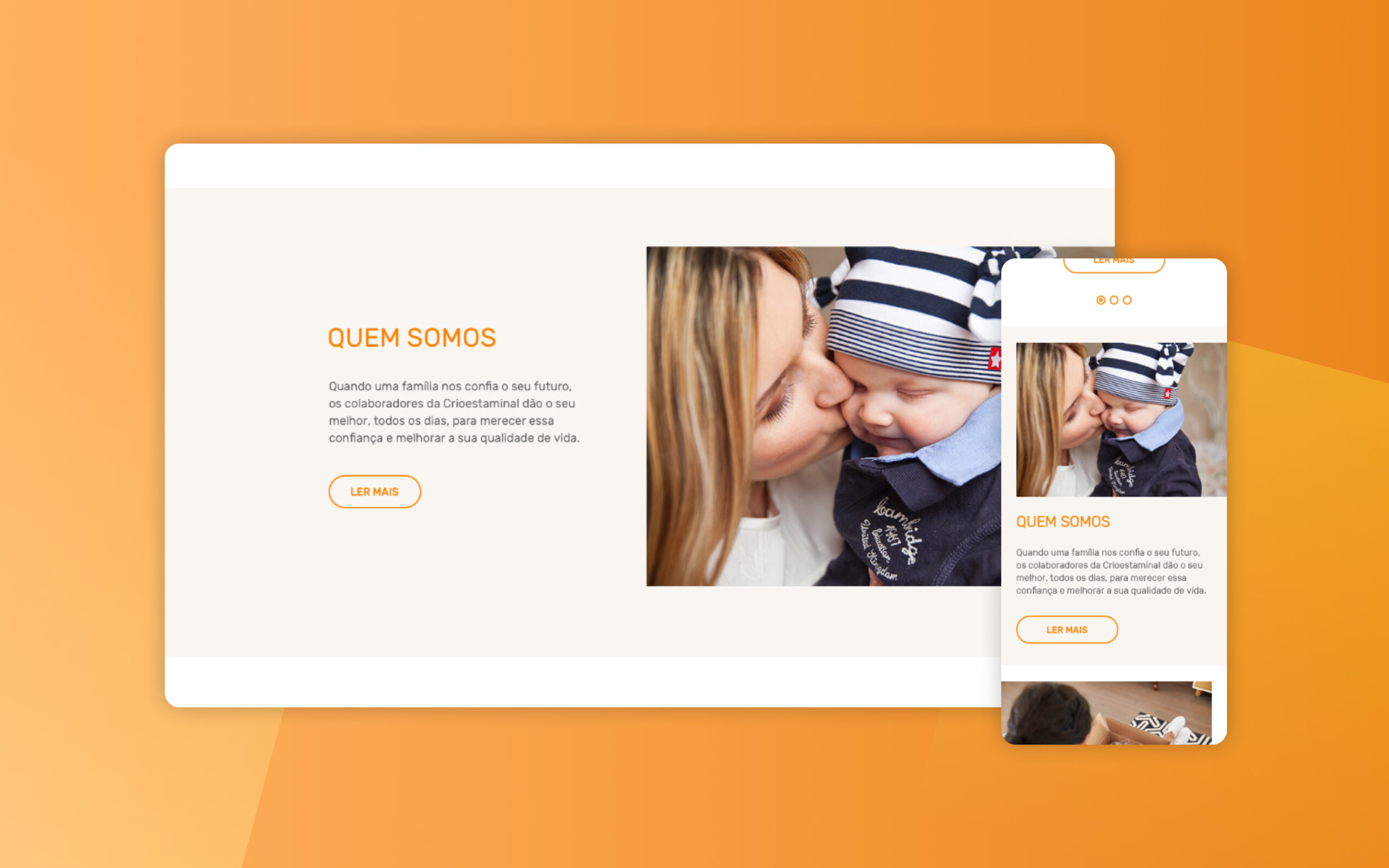
About Us
A small description about the company was added with a powerful photo.
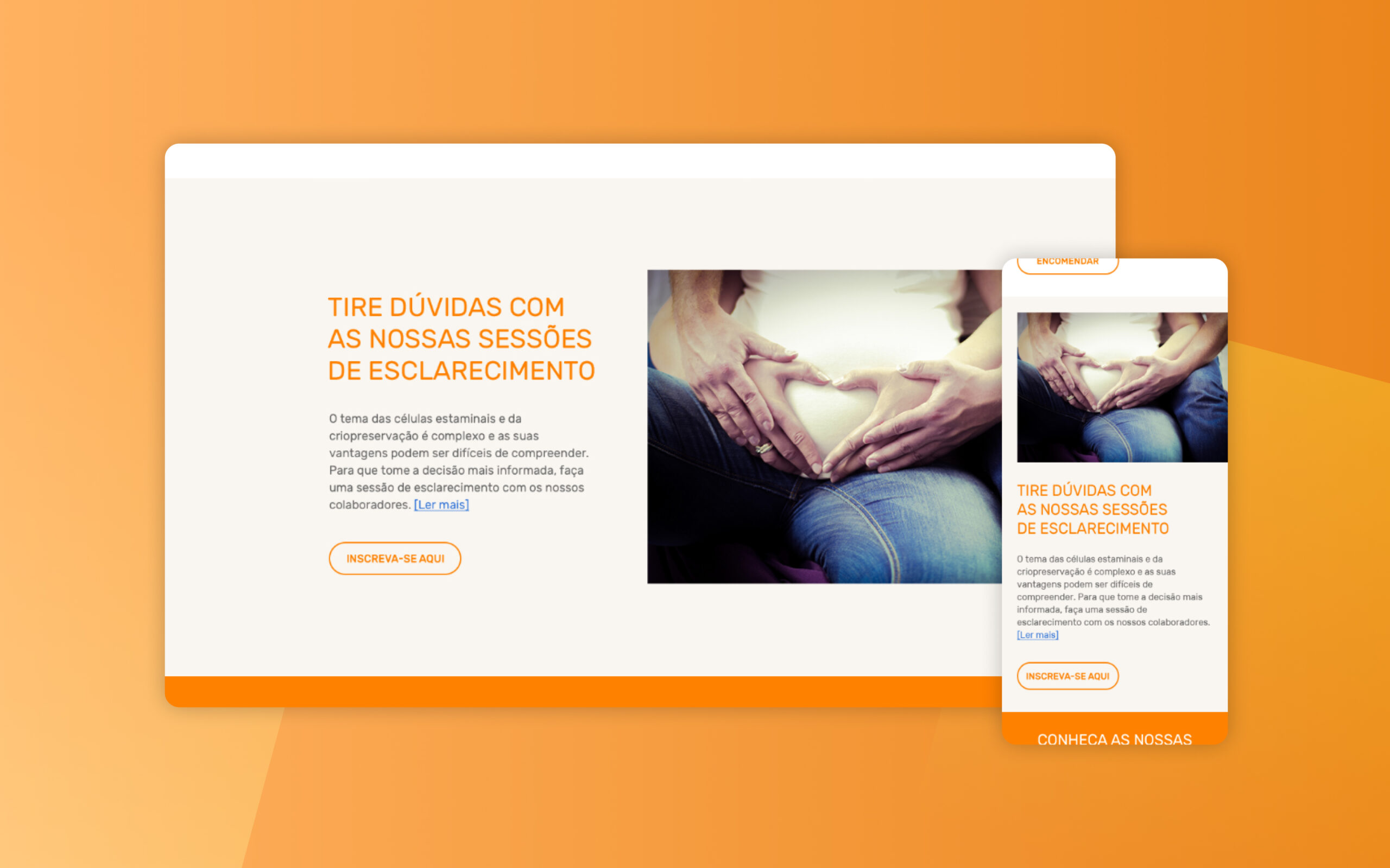
Question and Answer Sessions
Because this subject can be a little complex, it was created an area that will forward users to a page to sign up for a session where all their questions will be answered.
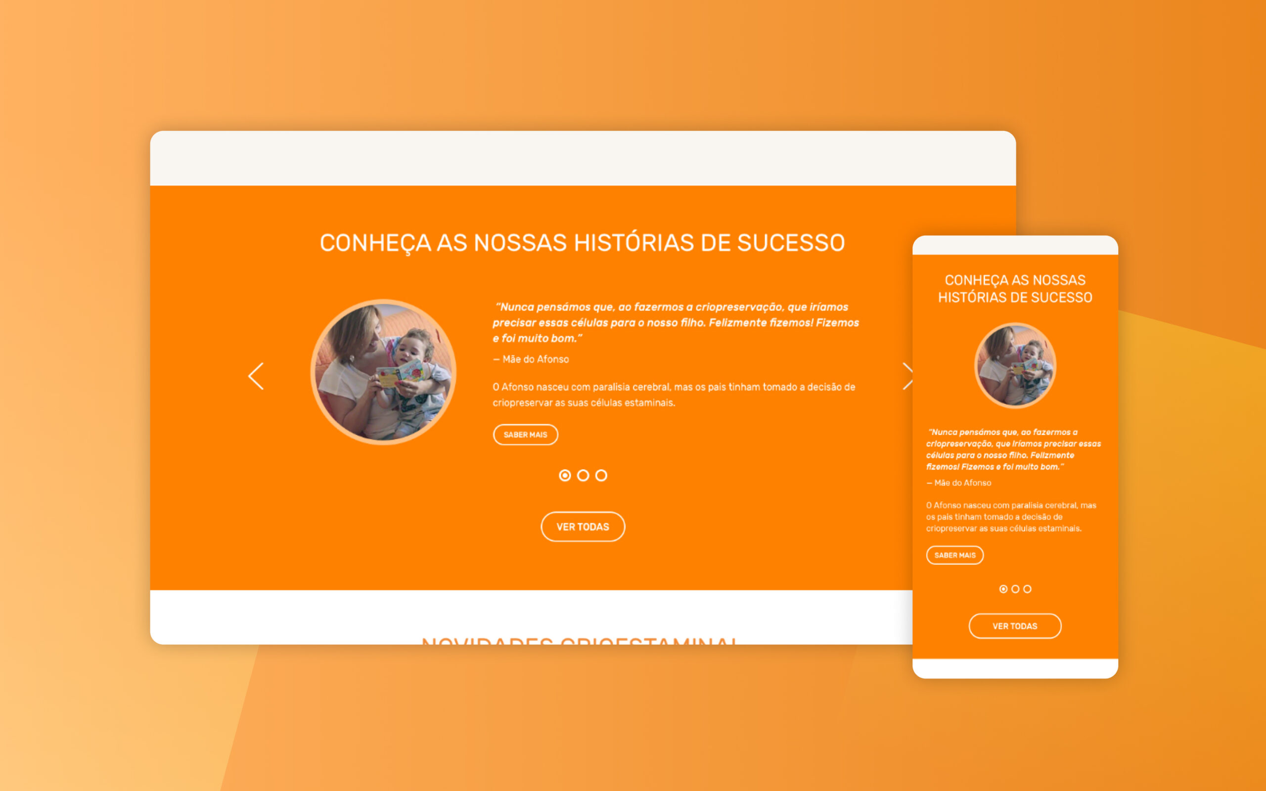
Stories
To build trust with the users, a section with stories was added to explain how was the process and experience with other parents. It is possible for the user to know more about each story or to be forward to a page with all stories.
Secondary Banners
All secondary banners have a clear and strong headline with a short explanation about each subject. For the visual design of this element, it was used a gradient with the main colour of the brand.
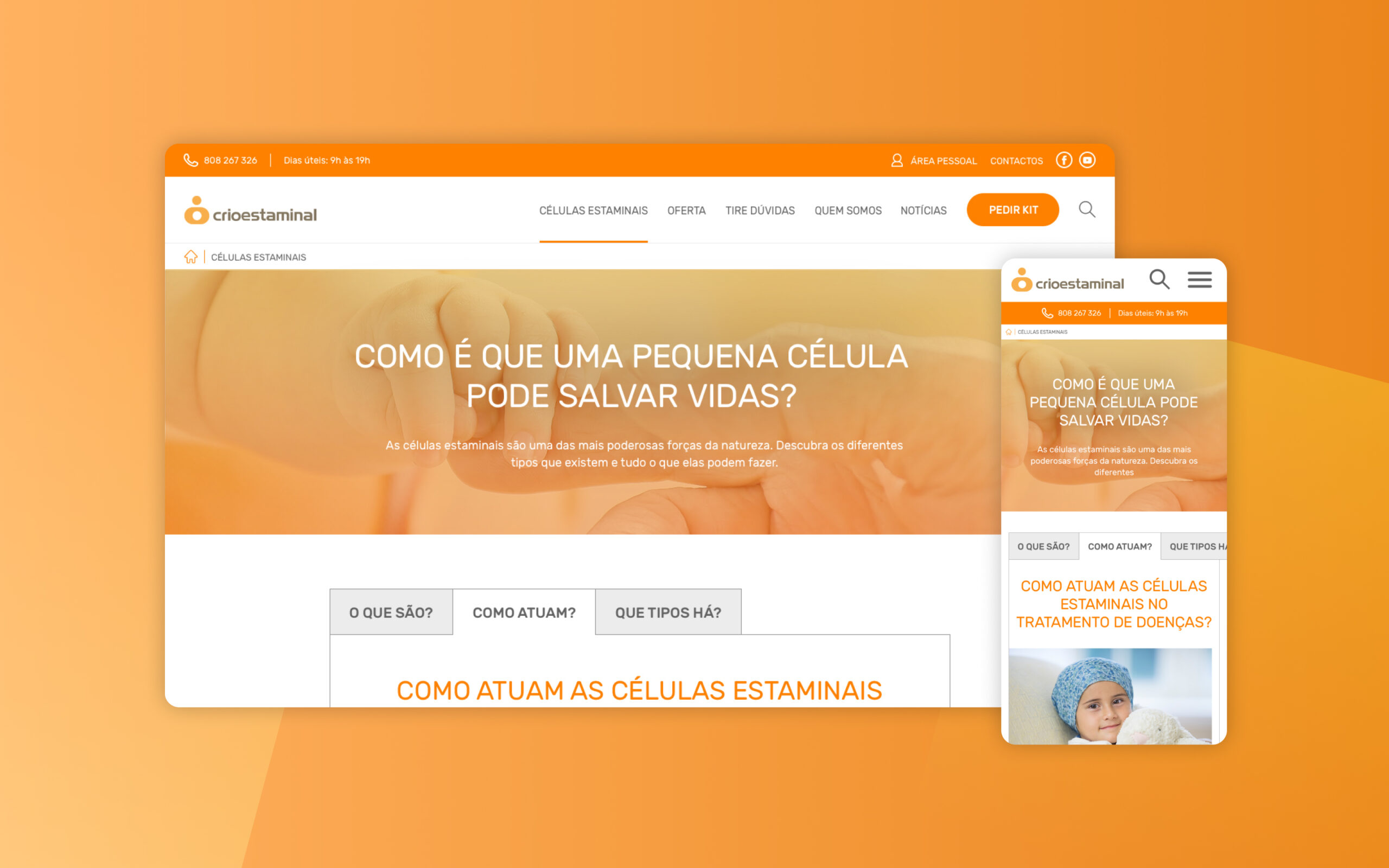
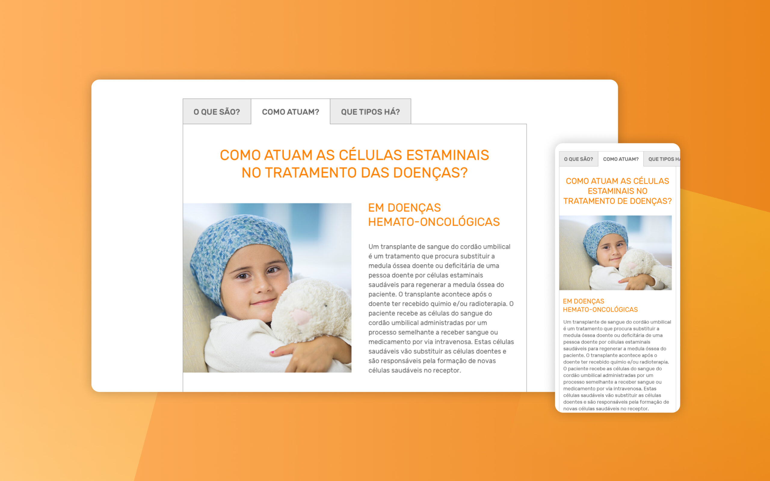
Quick Tabs
To organize all the information in a more clear and simple way, I decided to put all the tabs on horizontal with the main topics (What are they? How do they work? How many types there are?).
Interactive Prototype
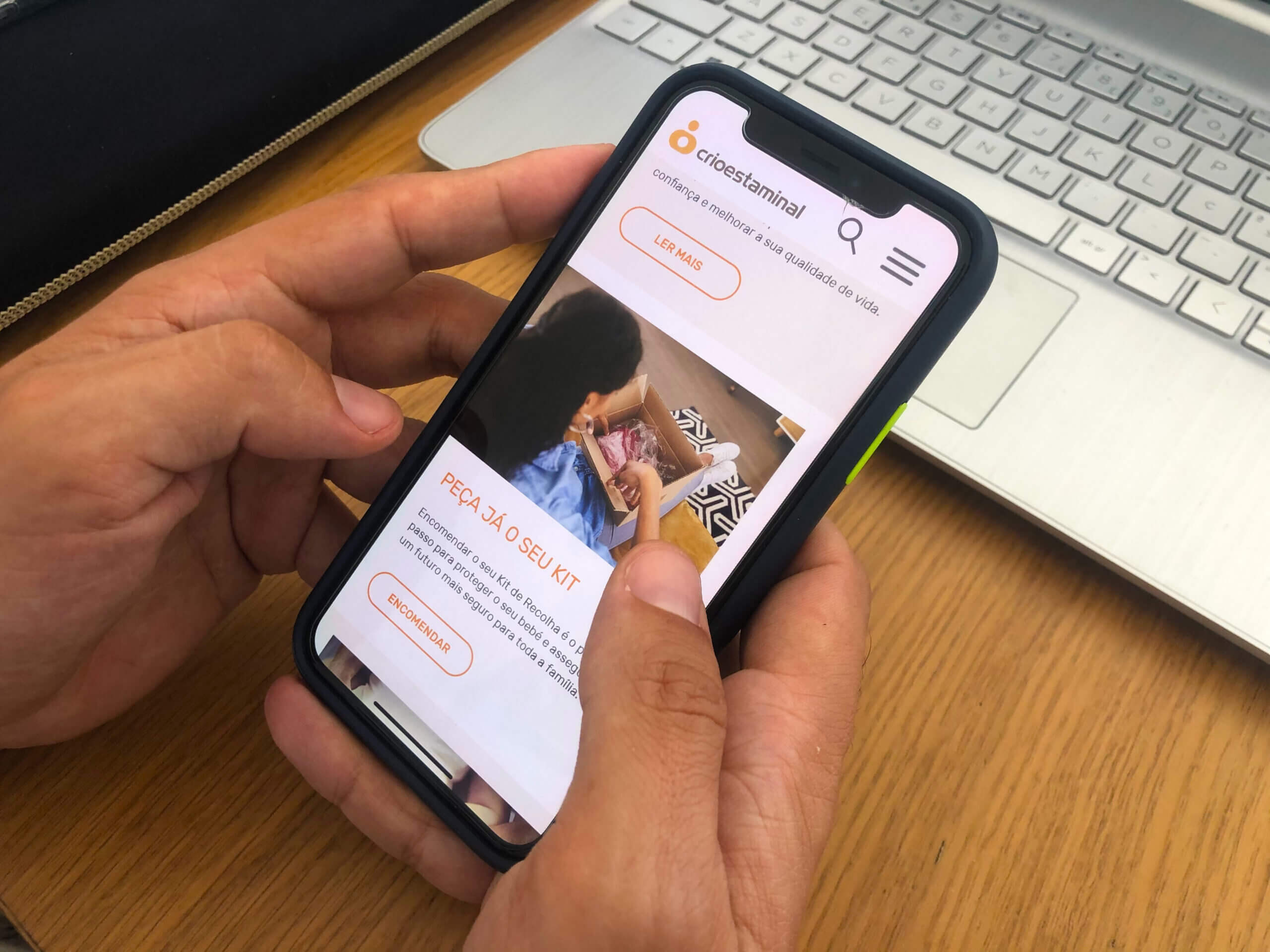
Below it’s the mobile interactive prototype that I designed for this project. It shows the behaviour of the mobile website.
3. Testing and improving the idea
Testing the solution
With the interactive prototype, I conducted usability tests to find out if users were having any usability problems and with the finals results I improved the website.
Usability Tests (Scenarios)
I created five tasks where each one was focused in one specific part of the website:
→ You are planning to have new kids and you would like to know more about stem cells; → You are interested on this service and you would like to know more about the advantages of this company; → You would like to know how stem cells can treat diseases; → You would like to read feedback about previous parents that used this service; → After you read more about this service, you would like to request a kit;
Improvements
Here’re some improvements I made after I analyse the final results from this usability test:
Improvement #1
The information regarding stem cells is more organized with illustrations to explain the whole process.
Improvement #2
Requesting the kit is now easier and accessible to the user on each page.
Improvement #3
Stories section was highlighted on the homepage with more CTA buttons to forward the user to a specific story or to view all stories.
Learnings
It was amazing to apply all my skills regarding user research, information architecture and usability testing on this project. By doing research I could understand about the user’s pain points and improve the digital product.