Create a digital product to promote the venue and bring companies to host their events.
Context
Eventhafen is a large event venue based in Friedrichshafen (Germany). The main goal was to create a digital solution that would promote the venue and bring companies to host their events.
Solution
The solution was to create a responsive website which will show different types of events that are possible to do in the venue, how simple the booking process is and show previously held events.
Project Goals
– Design a user responsive website (for desktop and mobile); – Gather insights from users to understand their behaviour; – Perform usability tests with an interactive prototype and analyse the results to improve the final solution.
My Role
– Market research (competitor analysis); – Qualitative user research (interviews, personas and user stories); – Sitemap; – Information architecture; – Low-fidelity wireframes; – Visual design; – Interactive prototype; – User testing.
Agency
TJPA (Creative Director: Andreas Brücker)
1. Market and user research
Understanding the problem
With the information the company provided in the briefing, I decided to do market and user research to understand their competitors and user behaviour.
Competitor Analysis
By analysing and evaluating its competitors, the competitor analysis allowed me to understand their pain points. This method allowed me to find new solutions for problems and find out new opportunities. Below I describe a brief summary which I did for four websites:
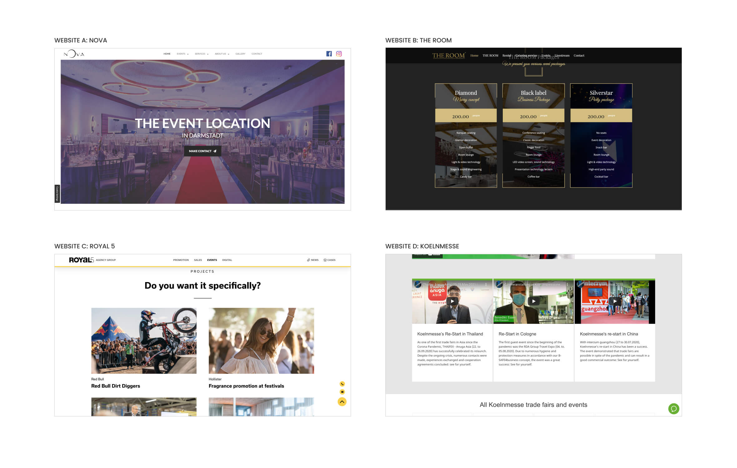
Website A: Nova
A powerful image on the main carousel is excellent to grab the users attention to this digital product. Although, the main title is not very appealing because it should be more emotional.
Website B: The Room
Showing the available packages is very important because it will make it easier for the user to choose one of them. Unfortunately, the text on this section should be larger to become more legible for the user to read.
Website C: Royal 5
It is extremelly important to show a portfolio of previous events. This builds trust between the user and the company. High quality images with reference of the brands name are also important to build trust.
Website D: KOELNMESSE
A video gallery communicates very well the energy of previous events. Although these three videos should provide a more clear content on the title and description to make it easier for the user to choose the video.
Interviews
I conducted interviews with users to find out new insights which allowed me to create a better digital product. I asked ten participants eight questions for this qualitative research. Below I placed the most important ones:
1. What is the most important element you look for on a website when you want to book an event venue? 2. Could you explain me the process you do to book an event venue? 3. Which device do you usually use to book an event venue? 4. Which new content would you like to see on the website?
These are some of the results I got from the interviews:
6
users mentioned they focus on the size of the venue and how many people can take it.
5
users mentioned they want to have a functionality to contact the venue in a quicker way.
9
users mentioned they book the venue on their desktop website.
5
users mentioned they would like to see more information regarding extra services (for instance: catering).
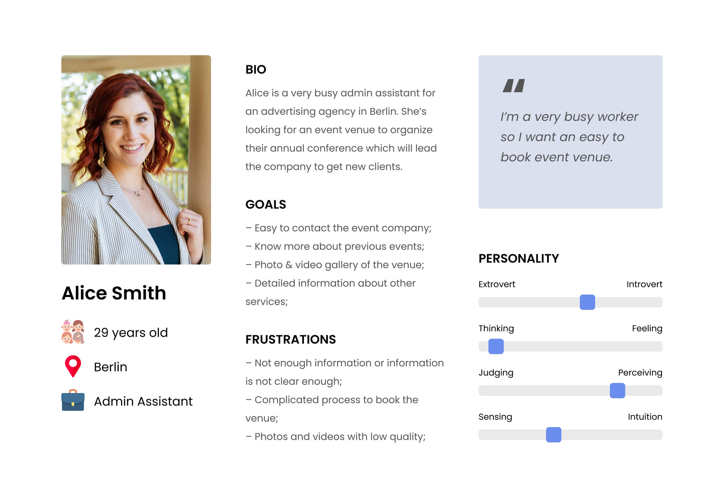
Persona
With the information I gathered from the interviews, I built a persona to make it very clear who will be the target user for this digital product.
User Stories
I created user stories based on the persona to understand all the contents this digital product should have. Below I placed three of them.
User Story #1
As a user, I want to know what types of events will be possible to organize in the venue.
Priority: High
User Story #2
As a user, I want to know the previous brands that were organized in the venue.
Priority: High
User Story #3
As a user, I want to be able to contact the event company quickly and in different ways.
Priority: Medium
2. Ideation
Designing the solution
In the second phase, I started by creating the website’s sitemap to understand how many pages there will be. Then I draw all the low-fidelity wireframes and I created the visual design based on the brand identity.
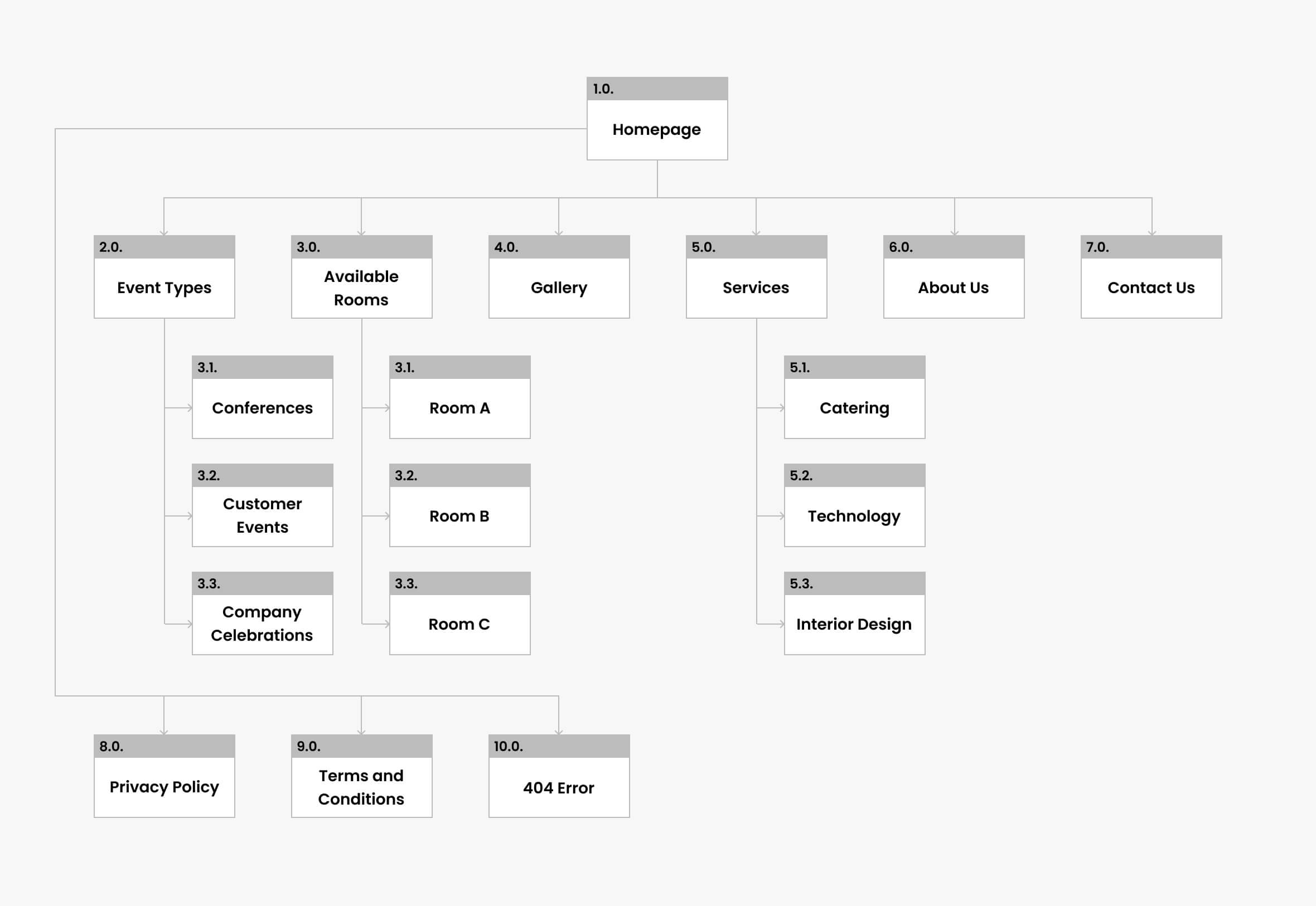
Sitemap
The previous research allowed me to build the sitemap with all hierarchies and connections between each page.
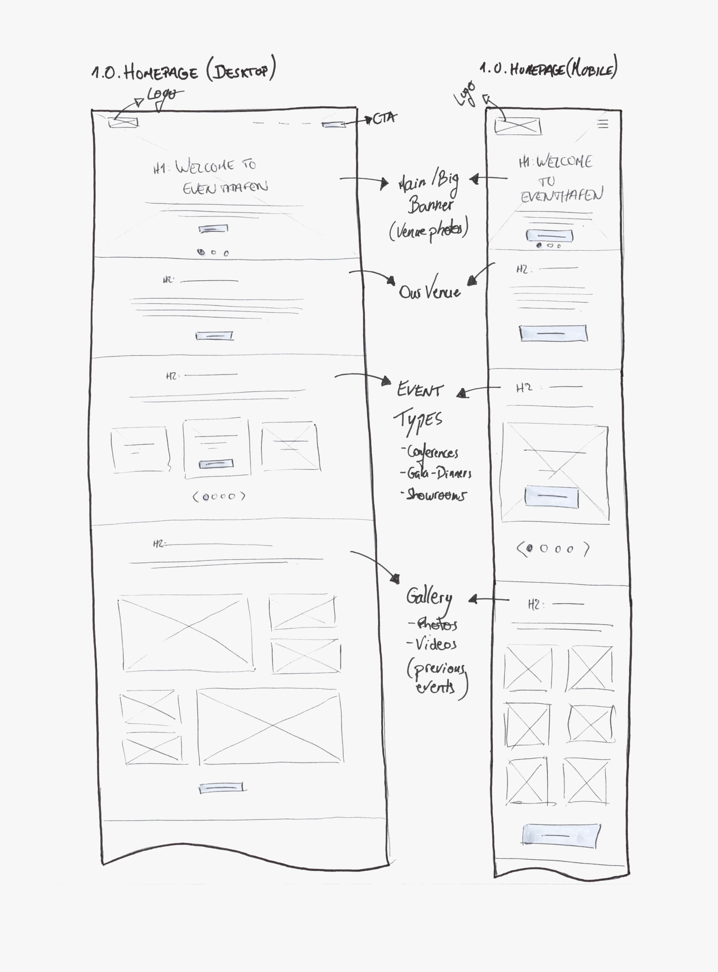
Low-Fidelity Wireframes
I started by sketching all low-fidelity wireframes on paper because it allowed me to focus more on the design of the information architecture for each page. Each page was designed for desktop and mobile.
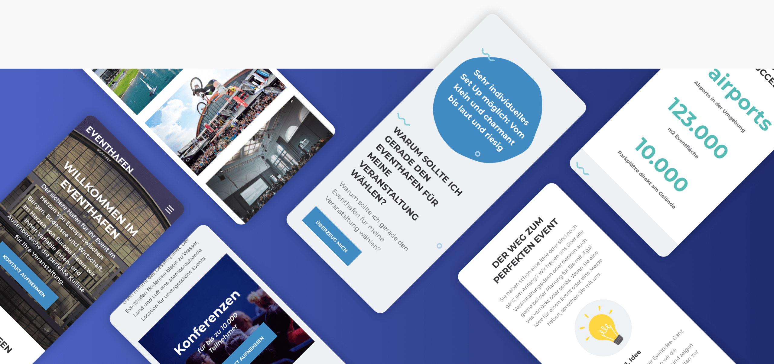
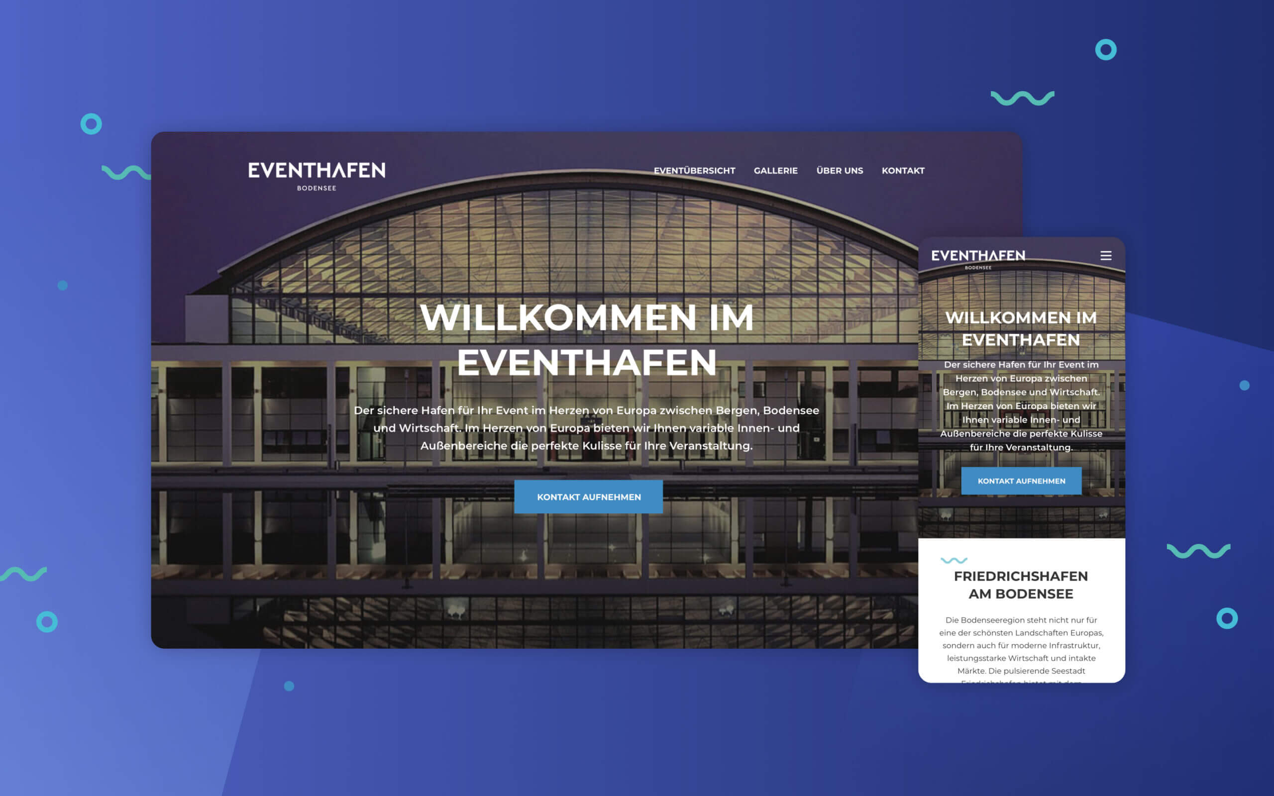
Visual Design
For the visual design of this digital product, I wanted to communicate a modern and clean concept. For the font I decided to use Montserrat due to its geometry and for the colours I decided to use blue and emerald due to the concept of the brand identity which is related with the nearby lake.
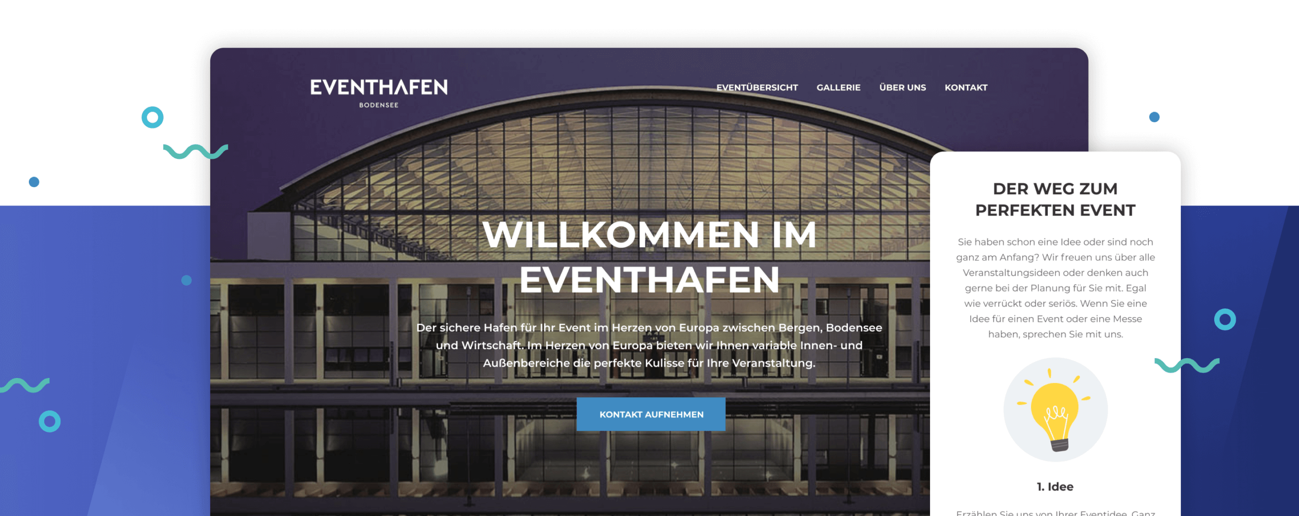
Main Header
For the main header on the homepage I decided to place a full-screen photo because I wanted to communicate the powerful size of the venue.
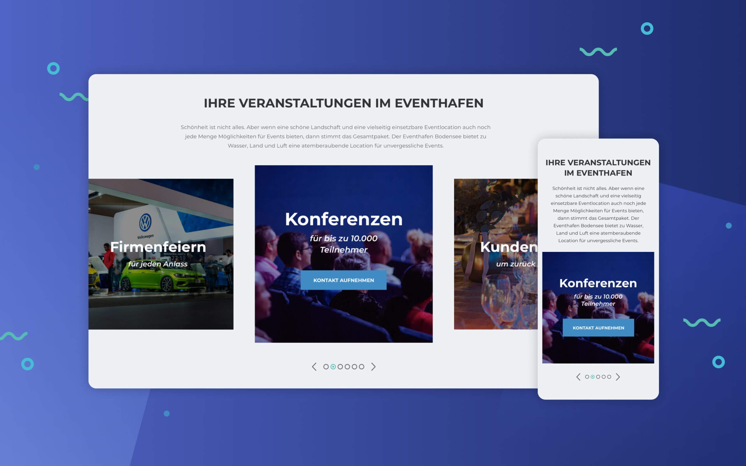
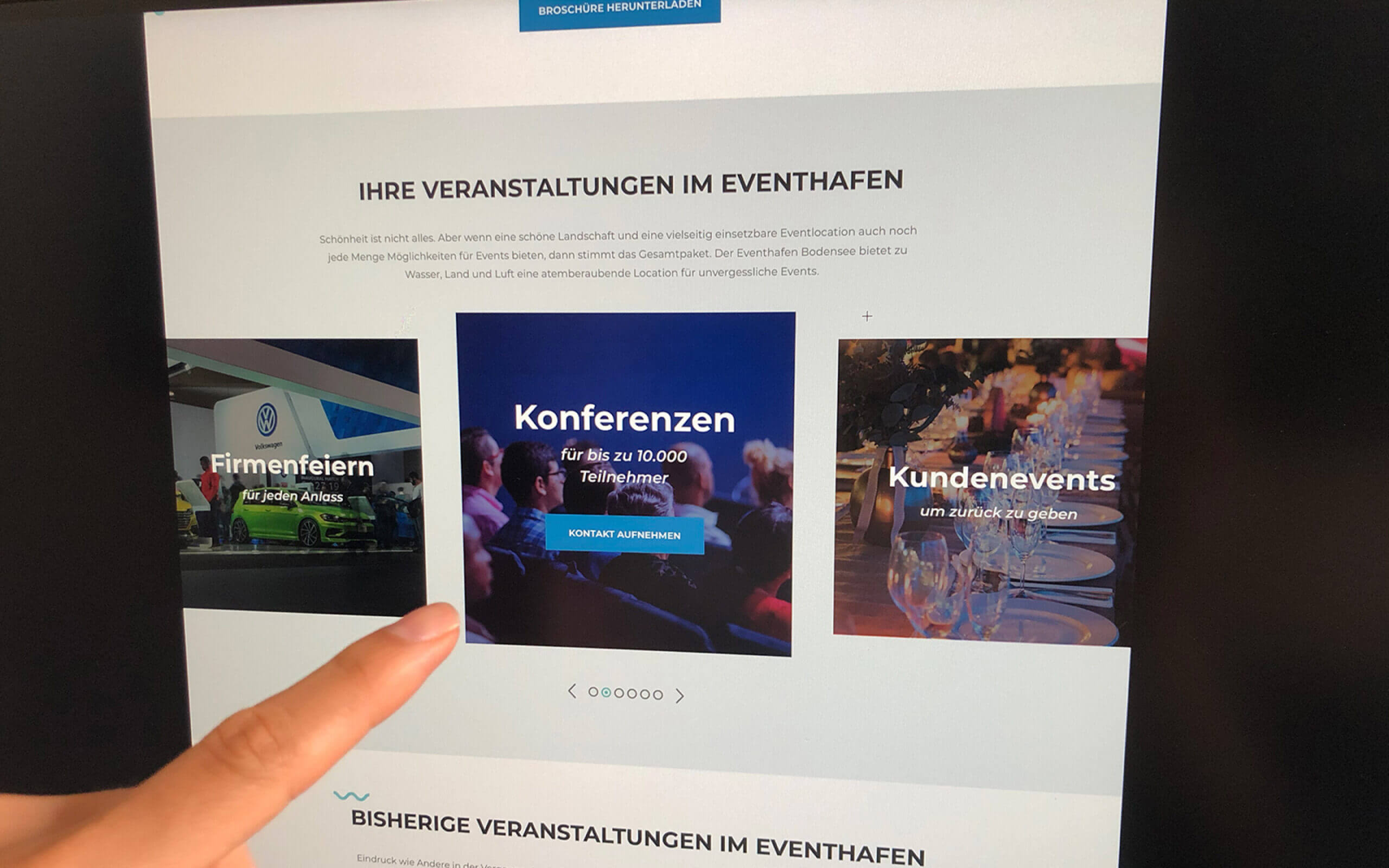
Event Types
It was also important to show to the user different types of events the venue can hold. I decided to put a carousel with photos related with the type of events to promote them.
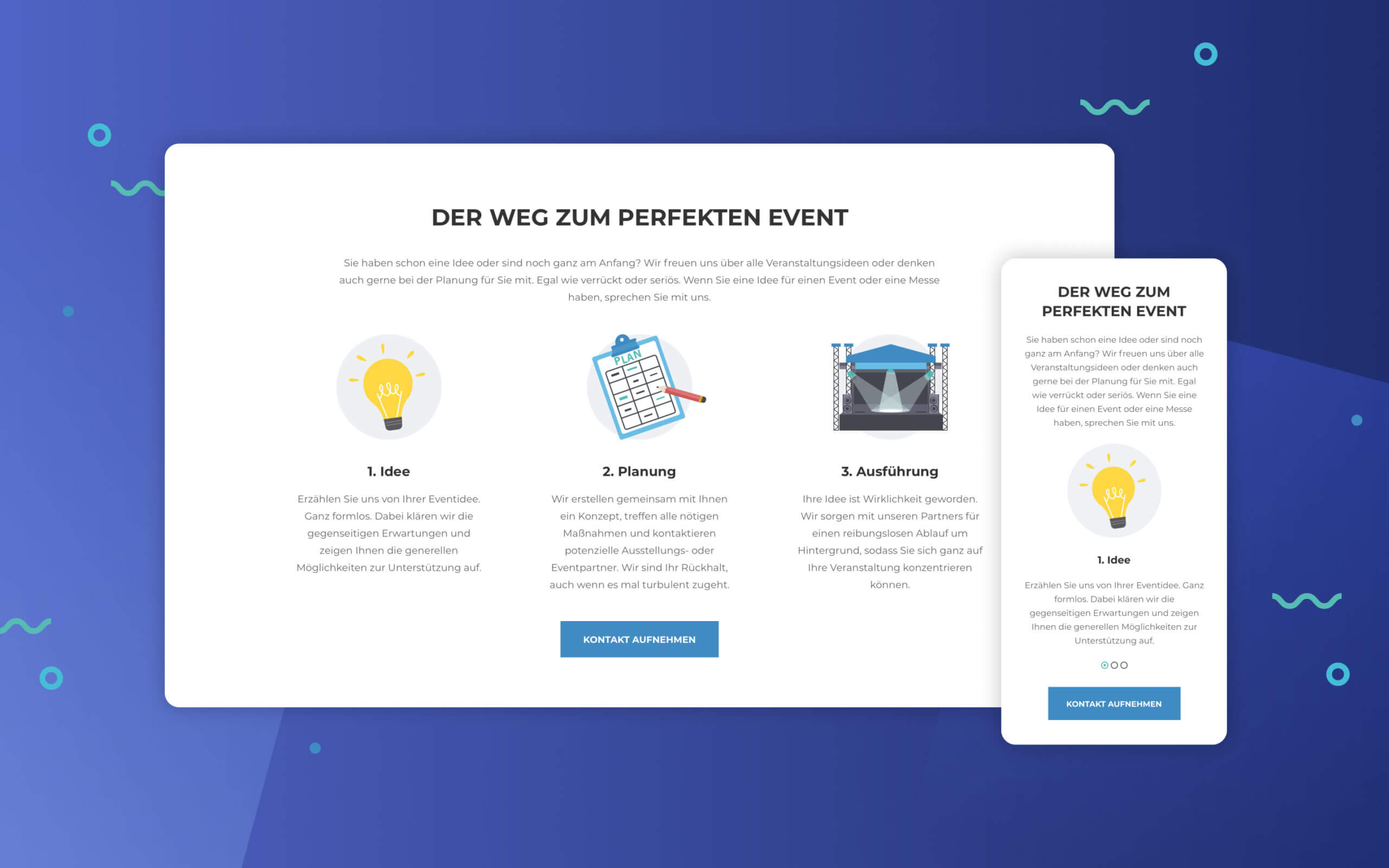
Booking Process
Based on the user research, one of the main conclusions was the user wants to have clear idea of the booking process. Here I decided to use flat design illustrations to communicate a clear message.
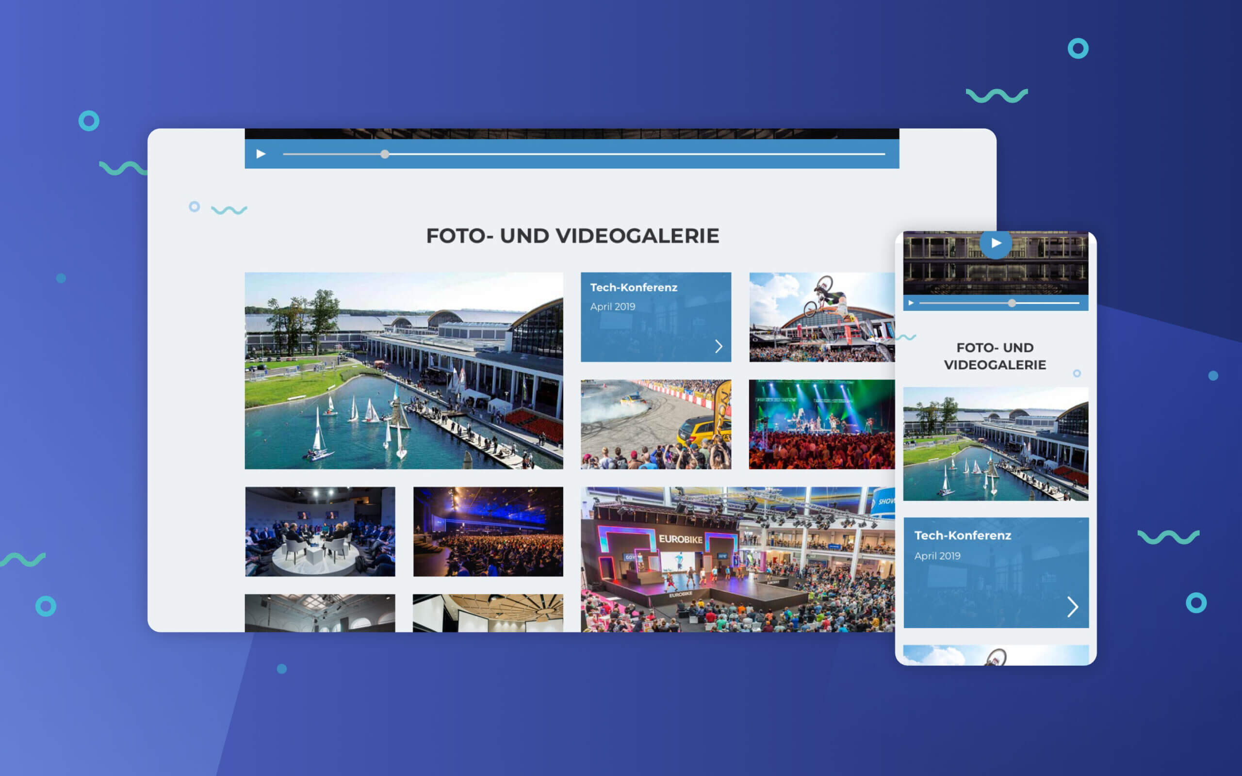
Photo and Video Gallery
A gallery to view photos and videos of previous events. This will make the user to have a clear idea which brands already organize their events in the venue.
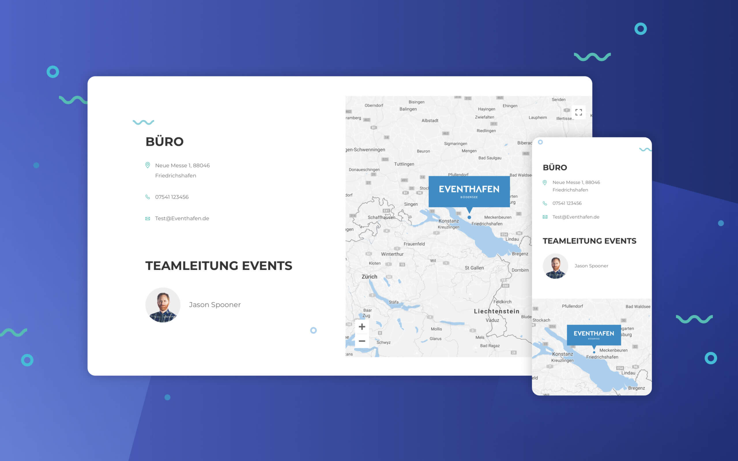
Contact Us
The map allows the user to have a clear idea where the venue is located. Contact details are also listed for the user to get in touch in case there is any questions.
3. Testing and improving the idea
Testing the solution
I conducted usability tests with an interactive prototype to find out if users were having any usability problems and with the results I collected I improved the website.
Usability Tests (Scenarios)
I created five scenarios/tasks focused on different parts of the website:
→ The event you want to organize is for 8.000 attendees and you need to find out if the venue can hold that amount of people; → You want to find out where exactly the venue is located; → You enjoyed a lot the photos and videos from previous events and you would like to contact them to request a tour in the venue; → You want to organize your event in this venue and you want to know what caterings options they have available; → You would like to know more about the history of this venue.
Improvements
Here’re some improvements I made after I analyse the final results from this usability test:
Improvement #1
The number of people that the venue can hold is now more easy to find.
Improvement #2
Below each gallery of photos and videos from previous events, there is now a button to send the user to the contact us page.
Improvement #3
The information architecture for the catering options is now more simple and organized.
Learnings
This project was a great opportunity to apply all my skills regarding user research, product design and usability testing. It allowed me to improve my communication skills during the research processes and improve the final design solution.